Four years ago we posted on Nate Silver’s, and other forecasters’, triumph over pundits. In contrast, after yesterday’s presidential election, results contradicted most polls and data-driven forecasters, several news articles came out wondering how this happened. It is important to point out that not all forecasters got it wrong. Statistically speaking, Nate Silver, once again, got it right.
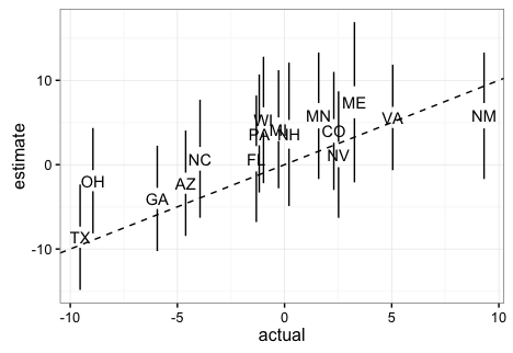
To show this, below I include a plot showing the expected margin of victory for Clinton versus the actual results for the most competitive states provided by 538. It includes the uncertainty bands provided by 538 in this site (I eyeballed the band sizes to make the plot in R, so they are not exactly like 538’s).

Note that if these are 95% confidence/credible intervals, 538 got 1
wrong. This is exactly what we expect since 15/16 is about
95%. Furthermore, judging by the plot here, 538 estimated the popular vote margin to be 3.6%
with a confidence/credible interval of about 5%.
This too was an accurate
prediction since Clinton is going to win the popular vote by
about 1% 0.5% (note this final result is in the margin of error of
several traditional polls as well). Finally, when other forecasters were
giving Trump between 14% and 0.1% chances of winning, 538 gave
him about a
30% chance which is slightly more than what a team has when down 3-2
in the World Series. In contrast, in 2012 538 gave Romney only a 9%
chance of winning. Also, remember, if in ten election cycles you
call it for someone with a 70% chance, you should get it wrong 3
times. If you get it right every time then your 70% statement was wrong.
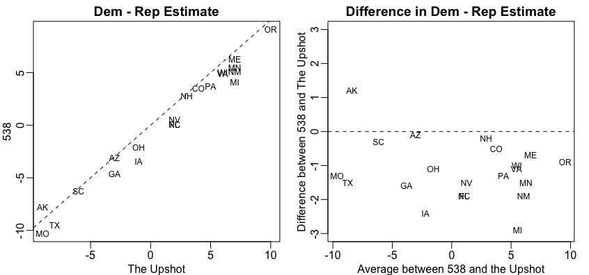
So how did 538 outperform all other forecasters? First, as far as I can tell they model the possibility of an overall bias, modeled as a random effect, that affects every state. This bias can be introduced by systematic lying to pollsters or under sampling some group. Note that this bias can’t be estimated from data from one election cycle but it’s variability can be estimated from historical data. 538 appear to estimate the standard error of this term to be about 2%. More details on this are included here. In 2016 we saw this bias and you can see it in the plot above (more points are above the line than below). The confidence bands account for this source of variabilty and furthermore their simulations account for the strong correlation you will see across states: the chance of seeing an upset in Pennsylvania, Wisconsin, and Michigan is not the product of an upset in each. In fact it’s much higher. Another advantage 538 had is that they somehow were able to predict a systematic, not random, bias against Trump. You can see this by comparing their adjusted data to the raw data (the adjustment favored Trump about 1.5 on average). We can clearly see this when comparing the 538 estimates to The Upshots’:

The fact that 538 did so much better than other forecasters should remind us how hard it is to do data analysis in real life. Knowing math, statistics and programming is not enough. It requires experience and a deep understanding of the nuances related to the specific problem at hand. Nate Silver and the 538 team seem to understand this more than others.
Update: Jason Merkin points out (via Twitter) that 538 provides 80% credible intervals.