Update: The ggjoy package has been deprecated. The ggridges CRAN package provides the same functionality.
I dislike violin plots because they look like Christmas ornaments.

It’s a pet peeve but there is somewhat of a practical reason as well. To demonstrate I created a dataset called dat that contains an outcome value from 25 different groups.
One of the first steps I take when analyzing data is to look at the distribution of my data. If there are groups, I like to stratify and look at the distributions. Histograms and smooth density estimates are my favorite tools for visualizing distributions. I have 25 groups in this data so I would start by quickly looking at a random subset:
dat %>% filter(group %in% c("A","H","I","P")) %>%
  ggplot(aes(value)) +
  geom_histogram(binwidth = 0.5, color="black") +
  facet_grid(.~group)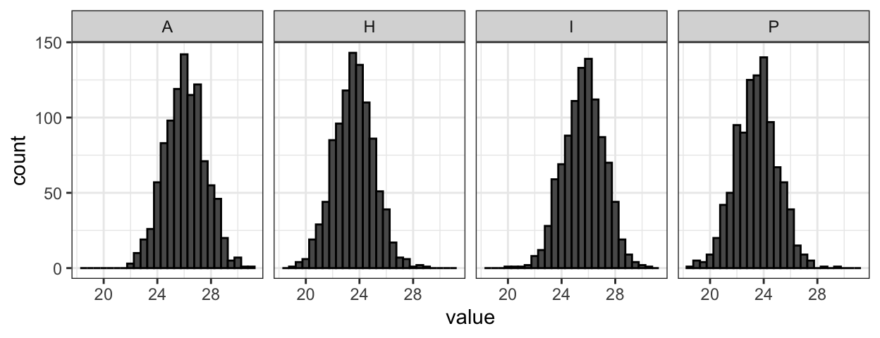
This plot shows me that the data looks normally distributed. To see how the groups compare to each other, a first step is to look at boxplots with groups reordered by their median value.
dat %>% mutate(group = reorder(group, value, median)) %>%
  ggplot(aes(group, value)) + geom_boxplot()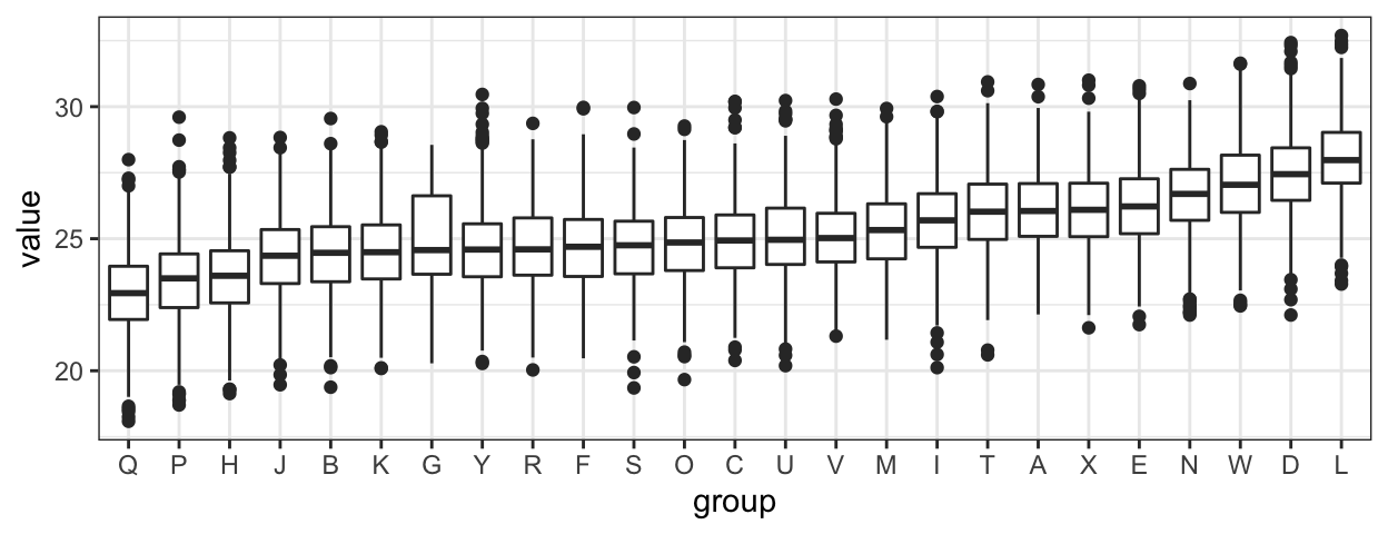
If you look close enough you note that group G looks a bit different: larger variance. But by summarizing into only five numbers, the boxplot misses an important characteristic of the data. Violin plots let you see the distributions rather than these five points:
dat %>% mutate(group = reorder(group, value, median)) %>%
  ggplot(aes(group, value)) + geom_violin(fill = "blue")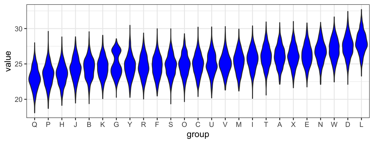
Do you see it? If you look closely, group G appears to be bimodal. But why is it hard for me to see?
- Adding a mirror image of the density to make them resemble boxplots in some manner makes them look like Christmas ornaments and distracts me.
- I am used to looking at histograms and densities with the variable in the x-axis not the y-axis.
I therefore prefer to stack histograms or density estimators vertically. So I was happy to learn about the ggjoy package that let’s you make such a plot in one line of code and produces a much more aesthetically pleasing plot than stacking histograms using, for example, facets.
library(ggjoy)
dat %>% mutate(group = reorder(group, value, median)) %>%
  ggplot(aes(x=value, y=group, height=..density..)) +
  geom_joy(scale=0.85)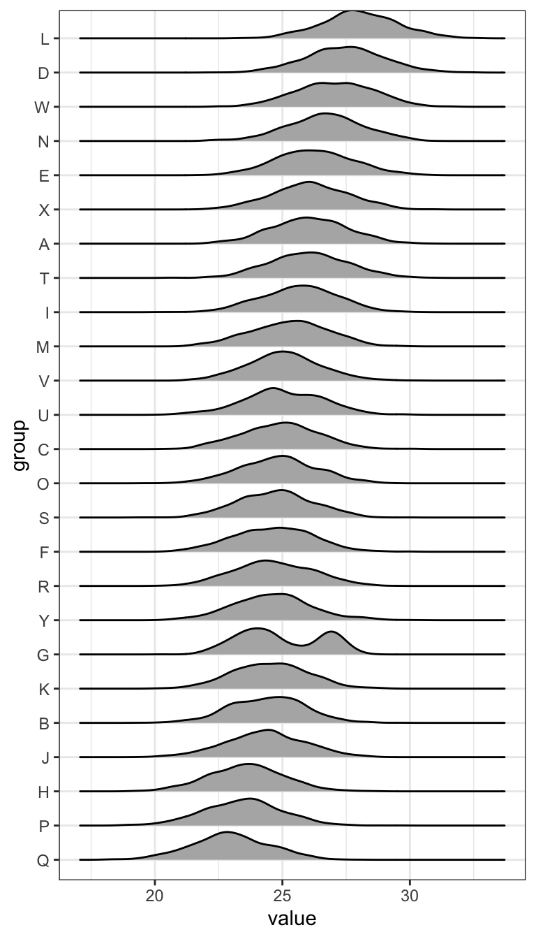
Note how quickly we notice the bimodal group. I am hoping people start using joy plots instead of violin plots. To install and try out the package use this:
library(devtools)
install_github("clauswilke/ggjoy")