During preparation for class I sometimes think up of animations that will explain the concept I am teaching. I sometimes share the resulting animations on social media via @rafalab.
John Storey recently asked if the source code is publicly available. Because I am not that organized, and these ideas come about during last minute preparations, the code was spread across several unrelated files. John’s request motivated me to include the code in one post.
All these gifs are paginated R plots. You will see in the code that I used different approaches to converting individual plots to animated gifs. The first (not recommended) was to save files then do a system call to the ImageMagick convert tool. Through a simplystats comment, from Yihui Xie, I learned about the saveGIF function from the animation package, which is what I now use when the plots are made in R base. When using ggplot I use David Robinson’s gganimate package. Finally, if I want to add special effects, like phasing, I use the online Animated GIF maker.
Below is the code for each of the gifs I have shared roughly ordered by popularity. Remember this code was written last minute so please don’t judge me. Actually, you can critique all you want, that’s how we learn.
Simpson’s Paradox
This gif illustrates Simpson’s paradox. We see that \(X\) and \(Y\) have strong negative correlation. However, once we stratify by a confounder \(Z\), encoded with color, the correlations flip to positive in each strata. The data is simulated, but we could see data like this if, for example, we looked at tutoring \(X\) and 9th grade test score \(Y\) data and then stratified students by their 8th grade test scores \(Z\).
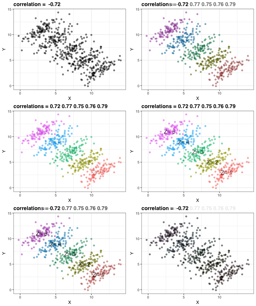
This gif is made up of just three plots. I saved them using RStudio’s Export tool then used Animated GIF maker to create the gif. Here is the code for the three plots:
library(tidyverse)
library(dslabs)
ds_theme_set()

## simulate data
N <- 100
Sigma <- matrix(c(1,0.75,0.75, 1), 2, 2)*1.5
means <- list(c(11,3), c(9,5), c(7,7), c(5,9), c(3,11))
dat <- lapply(means, function(mu)
  MASS::mvrnorm(N, mu, Sigma))
dat <- tbl_df(Reduce(rbind, dat)) %>%
  mutate(Z = as.character(rep(seq_along(means), each = N)))
names(dat) <- c("X", "Y", "Z")

## First plot
dat %>% ggplot(aes(X,Y)) + geom_point(alpha = .5) +
  ggtitle(paste("correlation = ", round(cor(dat$X, dat$Y), 2)))

## second plot
means <- tbl_df(Reduce(rbind, means)) %>% setNames(c("x","y")) %>%
  mutate(z = as.character(seq_along(means)))

corrs <- dat %>% group_by(Z) %>% summarize(cor = cor(X,Y)) %>% .$cor

p <- dat %>% ggplot(aes(X, Y, color = Z)) +
  geom_point(show.legend = FALSE, alpha = 0.5) +
  ggtitle(paste("correlations =",  paste(signif(corrs,2), collapse=" ")))
p

## third plot
p + annotate("text", x = means$x, y = means$y,
             label = paste("Z=", means$z), cex = 5)
Loess
The first educational animation I shared explains how local regression (loess) works. Basically, for each predictor value, say \(x_0\), assign positive weights to points close to that value, fit a line with weighted regression, keep the fitted value for \(x_0\), move to the next point.
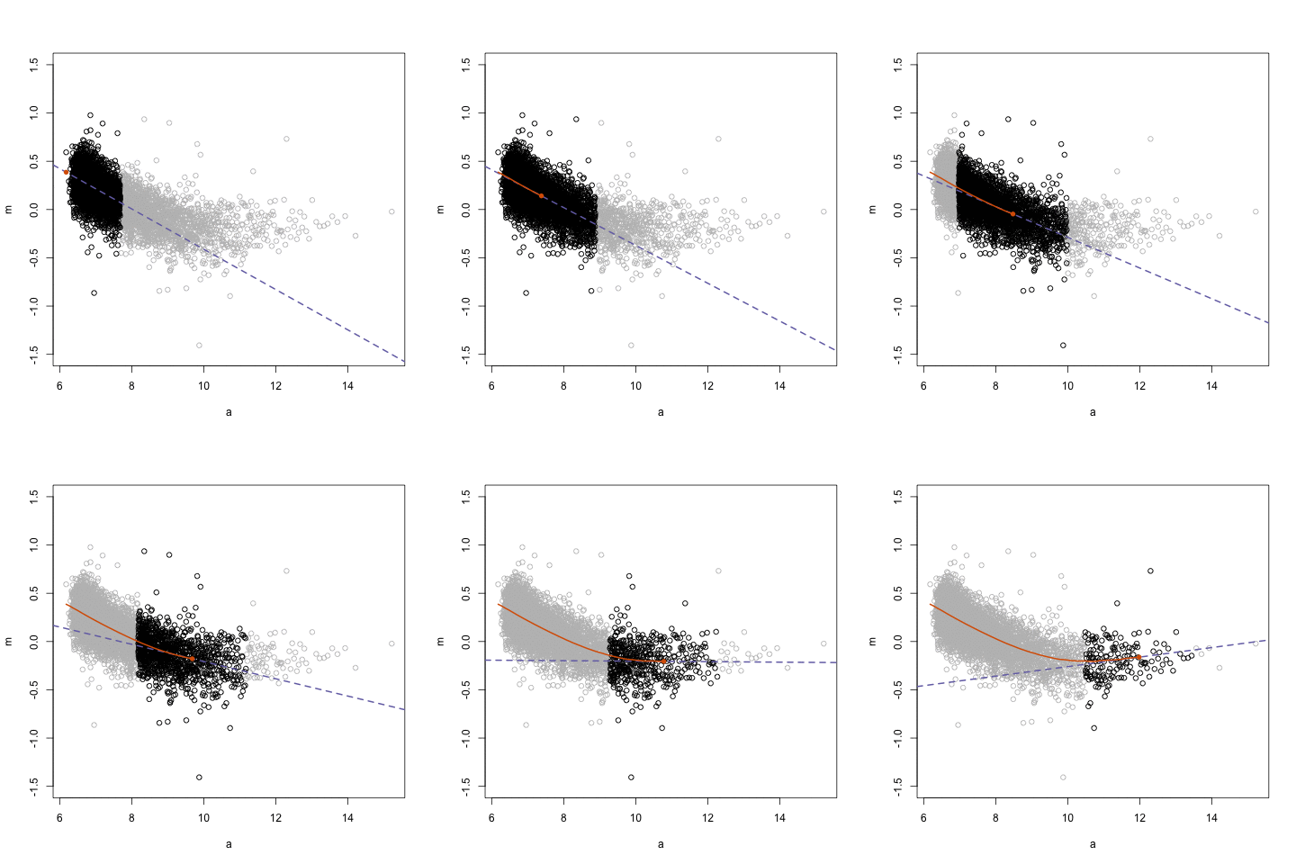
The data here comes from a microarray experiment. The figure shows an MA-plot (log ratio versus average of logs). I use the animation package to save the gif.
rafalib::mypar()

## load data
library(SpikeIn) ##to install: rafalib::install_bioc("SpikeIn")
data(SpikeIn95)

## get M and A for two arrays
spms <- pm(SpikeIn95)
i <- 10; j  <- 9 ## Pick two samples that show a non-linear relationship
M <- log2(spms[,i]) - log2(spms[,j])
A <- (log2(spms[,i]) + log2(spms[,j]))/2
o <- order(A)
a <- A[o]
m <- M[o]
ind <- round(seq(1,length(a),len=5000)) ##don't show all the points
a <- a[ind]
m <- m[ind]

## make gif
centers <- seq(min(a),max(a),0.1)
windowSize <- 1.5
smooth <- rep(NA,length(centers))
library(animation)
saveGIF({
  for(i in seq(along=centers)){
    center <- centers[i]
    ind=which(a > center-windowSize & a<center+windowSize)
    fit<-lm(m~a, subset=ind)
    smooth[i]<-predict(fit, newdata=data.frame(a=center))
    if(center<12){
      plot(a, m, ylim=c(-1.5,1.5), col="grey")
      points(a[ind], m[ind])
      abline(fit, col=3, lty=2, lwd=2)
      lines(centers[1:i], smooth[1:i], col=2, lwd=2)
      points(centers[i], smooth[i], col=2, pch=16)
    }
  }
},'loess.gif', interval = .15)
Life Expectancy versus Fertility Rates
This gif is recreating an animation shown by Hans Rosling’s in his talk New Insights on Poverty. The point of the animation is to show the power of data visualization for combating misconceptions. In this particular instance Hans Rosling shows that the world was more dichotomous 40 years ago than it is today. Dividing the world into western rich countries with small families/long life spans and a developing world with large families/short life spans is no longer accurate.
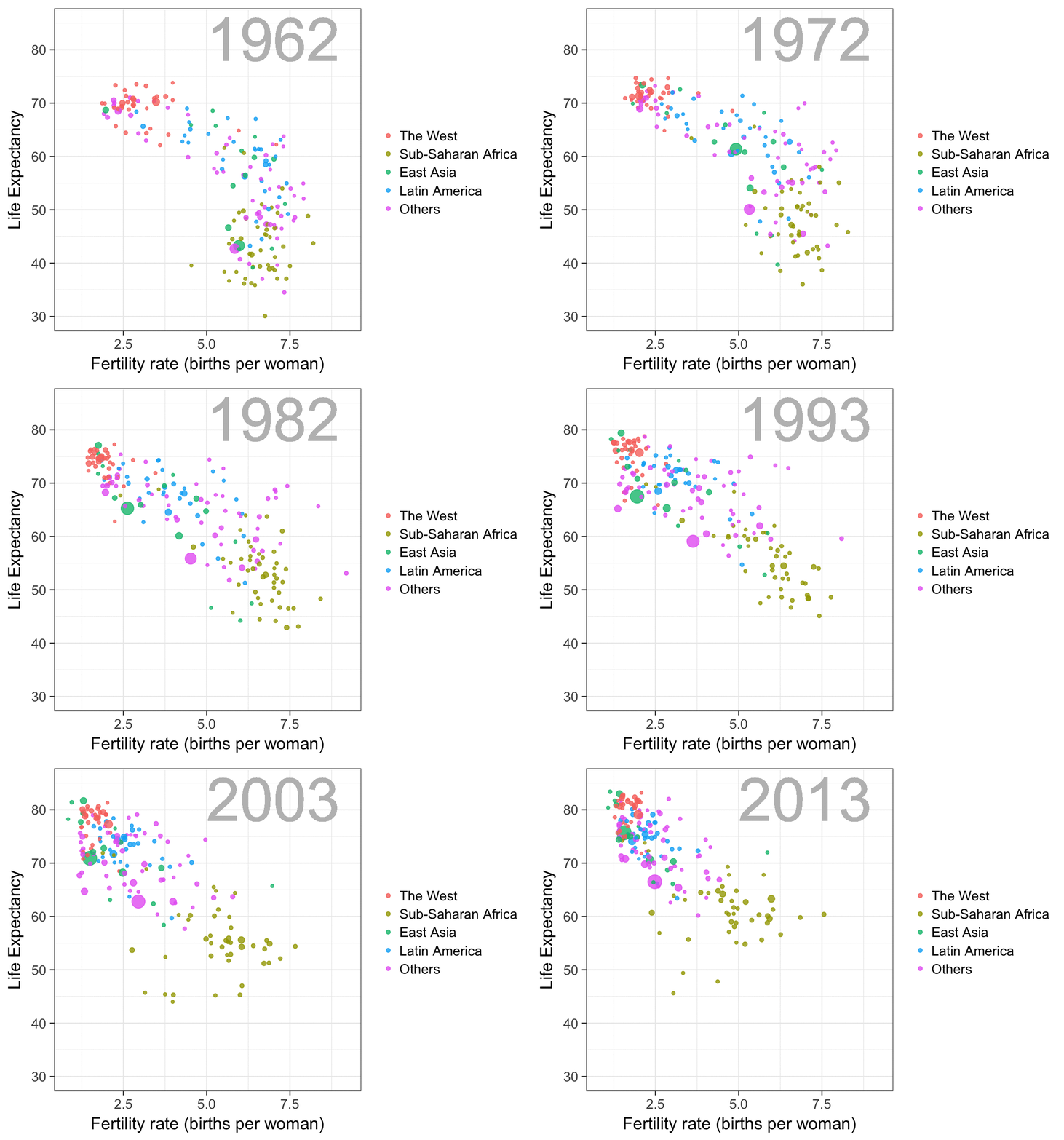
The code for this plot is quite simple, thanks to the gganimate package.
library(tidyverse)
library(dslabs)
data(gapminder)

west <- c("Western Europe","Northern Europe","Southern Europe",
          "Northern America","Australia and New Zealand")

gapminder <- gapminder %>%
  mutate(group = case_when(
    .$region %in% west ~ "The West",
    .$region %in% c("Eastern Asia", "South-Eastern Asia") ~ "East Asia",
    .$region %in% c("Caribbean", "Central America", "South America") ~ "Latin America",
    .$continent == "Africa" & .$region != "Northern Africa" ~ "Sub-Saharan Africa",
    TRUE ~ "Others"))
gapminder <- gapminder %>%
  mutate(group = factor(group, levels = rev(c("Others", "Latin America", "East Asia","Sub-Saharan Africa", "The West"))))

library(gganimate)
theme_set(theme_bw(base_size = 16))
years <- seq(1962, 2013)
p <- filter(gapminder, year%in%years & !is.na(group) &
         !is.na(fertility) & !is.na(life_expectancy)) %>%
  mutate(population_in_millions = population/10^6) %>%
  ggplot(aes(fertility, y=life_expectancy,
             col = group, frame = year, size = population_in_millions)) +
  geom_point(alpha = 0.8) +
  guides(size=FALSE) +
  theme(plot.title = element_blank(), legend.title = element_blank()) +
  coord_cartesian(ylim = c(30, 85)) +
  xlab("Fertility rate (births per woman)") +
  ylab("Life Expectancy") +
  geom_text(aes(x=7, y=82, label=year), cex=20, color="grey")

gganimate(p, filename = "life-expectancy-vs-fertility-rate", title_frame = FALSE)
United Nations Voting Patterns
Here we used UN voting data provided by Erik Voeten and Anton Strezhnev to illustrate the concept of distance.
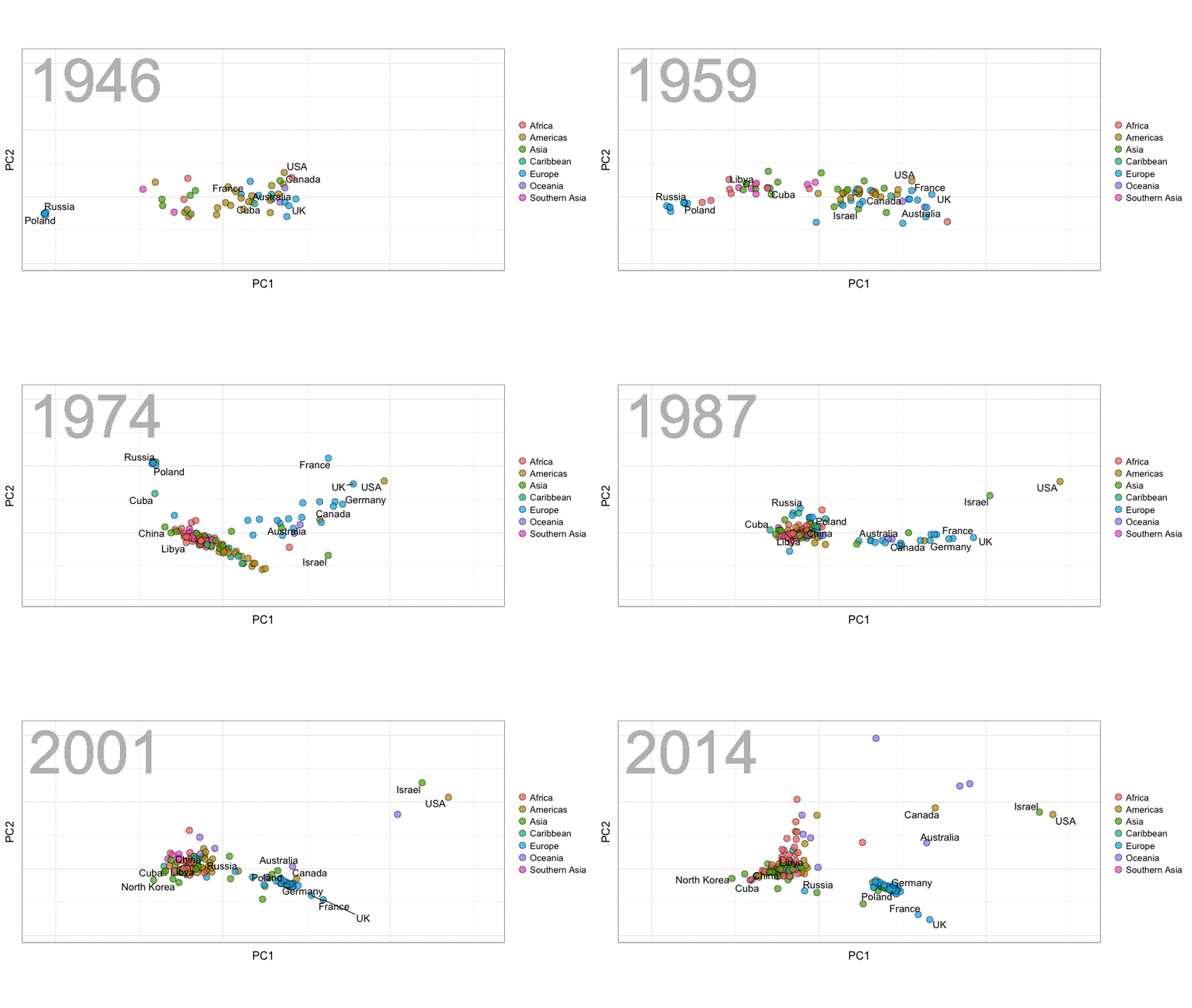
Below is the code. The wrangling code was provided by David Robinson. You will see that we smooth the distances across time to avoid having the points jump around too much.
library(tidyverse)
library(gganimate)
library(countrycode)
library(lubridate)
library(cluster)
library(broom)
library(ggrepel)
theme_set(theme_bw(base_size=16))

## Read in data and add country names. Change long names.

votes <- read_delim("https://github.com/datasciencelabs/data/raw/master/rawvotingdata13.tab", delim="\t")

votes <- votes %>% filter(vote <= 3) %>%
  mutate(country = countrycode(ccode, "cown", "country.name"),
         continent = countrycode(ccode, "cown", "continent"),
         region = countrycode(ccode, "cown", "region"))

## some wrangling
mapping <- c("United States of America"="USA",
          "United Kingdom of Great Britain and Northern Ireland"="UK",
          "Republic of Korea"="South Korea",
          "Democratic People's Republic of Korea"="North Korea",
          "Lao People's Democratic Republic"="Laos",
          "Yemen People's Republic"="South Yemen",
          "Saint Vincent and the Grenadines"="Saint Vincent",
          "Congo"="Congo Republic",
          "Federal Republic of Germany"="Germany",
          "Russian Federation"="Russia")

votes <- votes %>%
  mutate(country = plyr::revalue(country, mapping)) %>%
  separate(country, into = c("country", "extra"), sep=",",
           fill="right")

## Read vote descriptions. Mainly to get "important" ones. Join with original data.

url <- "https://raw.githubusercontent.com/datasciencelabs/data/master/un-resolutions-descriptions.csv"
descriptions <- read_csv(url,
                         col_types = list(date =
                                            col_date("%m/%d/%y")))
##from warning and looking at csv we see line 1843 has an extra "
descriptions[1483,"ec"] <-0

y <- year(descriptions$date)
year(descriptions$date) <- ifelse(y > 2030, y - 100, y)

descriptions <- descriptions %>%
  filter(year(date) != 2015)

votes <- votes %>%
  inner_join(descriptions) %>%
  select(-yes, -no, -abstain)

## Computing Distance by year

##Start by keeping only countries that have voted enough
votes <- mutate(votes, year = year(date))
countries_to_keep <- votes %>% filter(!is.na(continent)) %>%
  group_by(country) %>%
  summarize(n=n()) %>%
  mutate(percent = n/max(n)) %>% filter(percent>0.1 | country=="North Korea") %>%
  .$country

get_dist <- function(dat, min_vote=0.70){
  year <- dat$year
  X <- select(dat, -year, -rcid) %>% as.matrix() %>% t()
  voted <- rowMeans(!is.na(X))
  index <- which(voted>min_vote)
  d <- daisy(X[index,], metric="gower")
  mds <- cmdscale(d)
  ## fix arbitray sign
  if(mds["USA",1]<0) mds[,1]<-  -mds[,1]
  if(mds["USA",2]<0) mds[,2]<-  -mds[,2]
    data.frame(country=rownames(mds), PC1=mds[,1], PC2=mds[,2],
             row.names = NULL, stringsAsFactors = FALSE)
}

## us loess to smooth distances
dat <- votes %>% filter(country%in%countries_to_keep) %>%
  select(rcid, year, vote, country) %>%
  spread(country, vote) %>%
  group_by(year) %>%
  do(get_dist(.)) %>% ungroup() %>%
  group_by(country) %>%
  do(augment(loess(PC1~year, span=1/3, degree=1,data=.), data=.)) %>%
  mutate(PC1=.fitted) %>% select(-.fitted,-.se.fit) %>%
  do(augment(loess(PC2~year, span=1/3, degree=1,data=.), data=.)) %>%
  mutate(PC2=.fitted) %>% select(-.fitted,-.se.fit)

##add back contininent
dat <- votes %>% group_by(country) %>%
  summarize(continent = continent[1], region=region[1]) %>%
  right_join(dat, by="country")

##fix germany
dat <- dat %>%
  mutate(continent=ifelse(country=="Germany", "Europe", continent))

## create regions
dat <- dat %>% mutate(group = continent) %>%
  mutate(group = ifelse(region%in% c("Western Europe Eastern Europe","Caribbean","Southern Asia"), region, group))

## labels for select countries
labels <- c("Poland","France","USA","Russia","China","Germany","Cuba","Israel","Canada","Libya","North Korea","UK","Iran", "Australia")

## Now we make animation

p <- dat %>% ggplot(aes(frame = year)) +
  geom_point(aes(PC1, PC2, fill=group),
             pch=21, cex=4, alpha=.75) +
  geom_text_repel(data = filter(dat,country%in%labels),
                  aes(PC1,PC2,label=country),
                  cex=5) +
  theme(axis.ticks = element_blank(), axis.text = element_blank()) +
  coord_fixed(ratio = 1) +
  geom_text(aes(x=-0.38, y=0.35, label=year),
            cex=30, color="grey") +
  guides(fill=guide_legend(title=NULL))+
  theme(plot.title = element_blank())


gganimate(p, filename = "un-dist.gif", interval=0.35, ani.width = 850)
Random Forests
I used to find it hard to understand how Random Forests can produce smooth estimates given that they are based on trees. The gif helps illustrate how this can happen. I use 2008 presidential election data because I assume it is mostly driven by a smooth trend but with a couple of sharp edges that loess, for example, won’t catch. Note that, because we only have one predictor, the gif does not illustrate another important feature of Random Forests: how the random feature selection reduces correlation between trees.
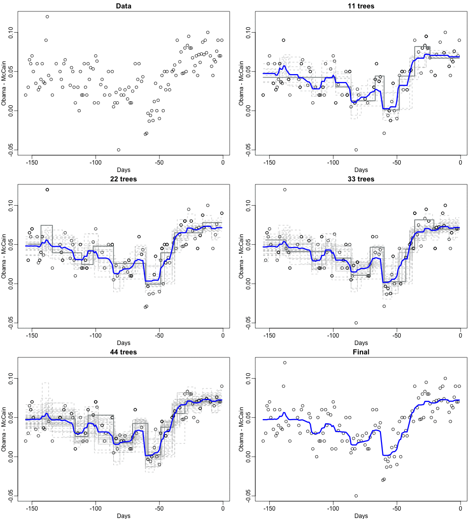
In the code you will see that I am using the old, not recommended way, of saving files and using a system call to convert.
library(tidyverse)
library(stringr)
library(lubridate)
library(tidyr)
library(XML)
library(rpart)
library(randomForest)

## read in 2008 election data
theurl <- paste0("http://www.pollster.com/08USPresGEMvO-2.html")
polls_2008 <- readHTMLTable(theurl,stringsAsFactors=FALSE)[[1]] %>%
  tbl_df() %>%
  separate(col=Dates, into=c("start_date","end_date"), sep="-",fill="right") %>%
  mutate(end_date = ifelse(is.na(end_date), start_date, end_date)) %>%
  separate(start_date, c("smonth", "sday", "syear"), sep = "/",  convert = TRUE, fill = "right")%>%
  mutate(end_date = ifelse(str_count(end_date, "/") == 1, paste(smonth, end_date, sep = "/"), end_date)) %>%
  mutate(end_date = mdy(end_date))  %>% mutate(syear = ifelse(is.na(syear), year(end_date), syear + 2000)) %>%
  unite(start_date, smonth, sday, syear)  %>%
  mutate(start_date = mdy(start_date)) %>%
  separate(`N/Pop`, into=c("N","population_type"), sep="\ ", convert=TRUE, fill="left") %>%
  mutate(Obama = as.numeric(Obama)/100,
         McCain=as.numeric(McCain)/100,
         diff = Obama - McCain,
         day=as.numeric(start_date - mdy("11/04/2008")))
polls_2008 <-  filter(polls_2008, start_date>="2008-06-01") %>%
  group_by(X=day)  %>%
summarize(Y=mean(diff))

set.seed(1)
path <- tempdir()
ntrees <- 50
sum <- rep(0,nrow(polls_2008))
res <- vector("list", ntrees)
XLIM <- range(polls_2008$X)
YLIM <- range(polls_2008$Y)
path <- tempdir()
for(i in 0:ntrees){
  png(file.path(path,sprintf("plot%02d.png",i)), width = 480, height = 350)
  rafalib::mypar(1,1)
  if(i==0){
    with(polls_2008, plot(X, Y, pch = 1, main="Data", xlim=XLIM,
                          ylim=YLIM,
                          xlab = "Days", ylab="Obama - McCain"))
  } else{
    ind <- sort(sample(1:nrow(polls_2008), replace = TRUE))
    tmp <- polls_2008[ind,]
    fit <- rpart(Y~X, data = tmp)
    pred <- predict(fit, newdata = tmp)
    res[[i]] <- data_frame(X = tmp$X, Y=pred)
    pred <- predict(fit, newdata = polls_2008)
    sum <- sum+pred
    avg <- sum/i
    with(tmp, plot(X,Y, pch=1, xlim=XLIM, ylim=YLIM, type="n",
                   xlab = "Days", ylab="Obama - McCain",
                   main=ifelse(i==1, paste(i, "tree"),paste(i, "trees"))))
    for(j in 1:i){
      with(res[[j]], lines(X, Y, type="s", col="grey", lty=2))
    }
    with(tmp, points(X,Y, pch=1))
    with(res[[i]], lines(X, Y, type="s",col="azure4",lwd=2))
    lines(polls_2008$X, avg, lwd=3, col="blue")
  }
  dev.off()
}
for(i in 1:5){
  png(file.path(path,sprintf("plot%2d.png",ntrees+i)), width = 480, height = 350)
  rafalib::mypar(1,1)
  with(polls_2008, plot(X, Y, pch = 1, main="Final", xlim=XLIM, ylim=YLIM,
                          xlab = "Days", ylab="Obama - McCain"))
  lines(polls_2008$X, avg, lwd=3, col="blue")
  dev.off()
}
system(paste0("cd ",path,";convert -loop 0 -delay 50 *.png rf.gif; mv rf.gif ",getwd(),"/"))
Ecological Fallacy
After sharing the Simpson’s Paradox gif, a couple of people asked me if this was the same as the ecological fallacy. These two are different. The ecological fallacy is when we extrapolate high correlation seen for the average of strata to individuals. To illustrate this I used data from gapminder included in the dslabs package. It shows logistic transformed infant survival rates versus log daily income. I start by showing a very high correlation at the region level and a lower correlation at the individual country level. This is because there is country to country variability within region.
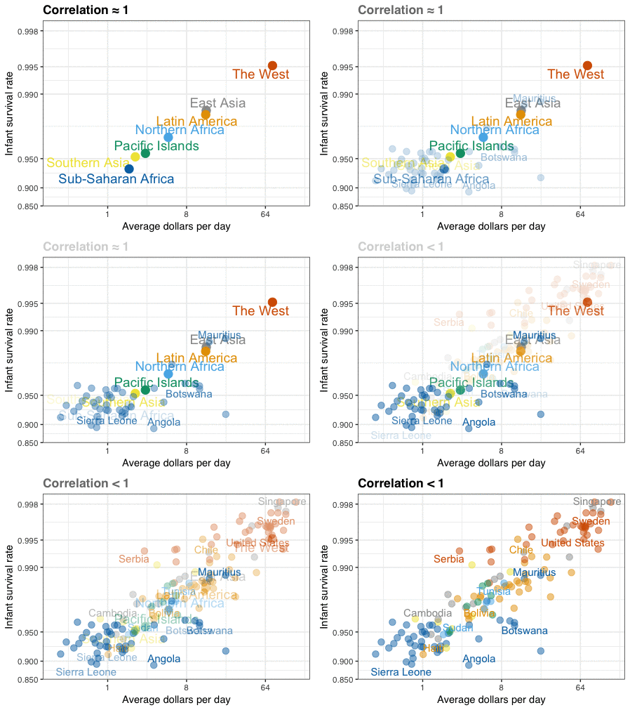
The gif is just three plots. I saved them using RStudio’s Export tool used Animated GIF maker to create the gif.
The first shows the averages, the second shows the individual values for Sub-Saharan Africa so you can see how one average breaks into more variable data, and the third shows all the individual data. I highlighted a few countries that show the variability. Note that I used a colorblind friendly palette. The code is a bit complex because I have to wrangle the Gapminder data.
library(tidyverse)
library(ggrepel)
library(dslabs)
ds_theme_set()

## load data
data(gapminder)

west <- c("Western Europe","Northern Europe","Southern Europe",
          "Northern America","Australia and New Zealand")
present_year <- 2010


## wrangle data and summarize
gapminder <- gapminder %>%
  mutate(dollars_per_day = gdp/population/365)

gapminder <- gapminder %>%
  mutate(group = case_when(
    .$region %in% west ~ "The West",
    .$region %in% "Northern Africa" ~ "Northern Africa",
    .$region %in% c("Eastern Asia", "South-Eastern Asia") ~ "East Asia",
    .$region == "Southern Asia"~ "Southern Asia",
    .$region %in% c("Central America", "South America", "Caribbean") ~ "Latin America",
    .$continent == "Africa" & .$region != "Northern Africa" ~ "Sub-Saharan Africa",
    .$region %in% c("Melanesia", "Micronesia", "Polynesia") ~ "Pacific Islands"))

logit <- function(p) log(p/(1-p))

color_blind_friendly_cols <- c("#999999", "#E69F00", "#56B4E9", "#009E73", "#F0E442", "#0072B2", "#D55E00", "#CC79A7")

surv_income <- gapminder %>%
  filter(year %in% present_year & !is.na(gdp) & !is.na(infant_mortality) & !is.na(group)) %>%
  group_by(group) %>%
  summarize(income = sum(gdp)/sum(population)/365,
            infant_survival_rate = 1-sum(infant_mortality/1000*population)/sum(population))

### First plot
surv_income %>% ggplot(aes(income, infant_survival_rate, label = group, color = group)) +
  scale_x_continuous(trans = "log2", limits = c(0.25, 150)) +
  scale_y_continuous(trans = "logit", limit = c(0.875, .9981),
                     breaks = c(.85,.90,.95,.99,.995,.998)) +
  geom_text_repel(size = 5, show.legend = FALSE) +
  geom_point(size=4, show.legend = FALSE) +
  ggtitle(paste("Correlation ≈", signif(with(surv_income,cor(log(income), logit(infant_survival_rate))),2))) +
  xlab("Average dollars per day") +
  ylab("Infant survival rate") +
  scale_color_manual(values=color_blind_friendly_cols)


highlight <- c("Sierra Leone", "Mauritius",  "Sudan", "Botswana", "Tunisia",
"Cambodia","Singapore","Chile", "Haiti", "Bolivia",
"United States","Sweden", "Angola", "Serbia")

## Third plot. I make before second because easier
tmp <- gapminder %>%
  filter( year %in% present_year & !is.na(gdp) & !is.na(infant_mortality) & !is.na(group) ) %>%
  mutate(infant_survival_rate = 1 - infant_mortality/1000)
tmp %>%
  ggplot(aes(dollars_per_day, infant_survival_rate, col = group, label = country)) +
  scale_x_continuous(trans = "log2", limits=c(0.25, 150)) +
  scale_y_continuous(trans = "logit",limit=c(0.875, .9981),
                     breaks=c(.85,.90,.95,.99,.995,.998)) +
  geom_point(alpha = 0.5, size = 3, show.legend = FALSE) +
  geom_text_repel(size = 4, show.legend = FALSE,
                  data = filter(tmp, year %in% present_year & country %in% highlight)) +
  ggtitle("Correlation < 1") +
  xlab("Average dollars per day") +
  ylab("Infant survival rate") +
  scale_alpha_manual(values=c(1,1)) +
  scale_color_manual(values=color_blind_friendly_cols) +
  guides(colour = guide_legend(override.aes = list(alpha = 1)))

## second plot
tmp <- gapminder %>%  filter( year %in% present_year & !is.na(gdp) & !is.na(infant_mortality) & !is.na(group) ) %>%
    filter(group %in% "Sub-Saharan Africa") %>%
    mutate(infant_survival_rate = 1 - infant_mortality/1000)

surv_income %>%
  filter(!group %in% "Sub-Saharan Africa") %>%
    ggplot(aes(income, infant_survival_rate, label = group, color = group)) +
  scale_x_continuous(trans = "log2", limits = c(0.25, 150)) +
  scale_y_continuous(trans = "logit", limit = c(0.875, .9981),
                     breaks = c(.85,.90,.95,.99,.995,.998)) +
  geom_text_repel(size = 5, show.legend = FALSE) +
  geom_point(size=4, show.legend = FALSE) +
  xlab("Average dollars per day") +
  ylab("Infant survival rate") +
  scale_color_manual(values=color_blind_friendly_cols) +
  geom_point(mapping=aes(dollars_per_day, infant_survival_rate, col = group), data =tmp, alpha = 0.5, size = 3, show.legend = FALSE) +
  geom_text_repel(mapping=aes(dollars_per_day, infant_survival_rate, col = group, label = country),
                  size = 4, show.legend = FALSE,
                  data = filter(tmp, year %in% present_year & country %in% highlight))+
    ggtitle(" ")
Bayes Rule
This simple animation shows, case by case, the results of applying a highly accurate diagnostic test to a population with low prevalence of disease. It helps illustrate how the posterior probability of having the disease given a positive test is lower than the accuracy of the test. You can use Bayes rule to determine the actual conditional probabilities. More details are here.
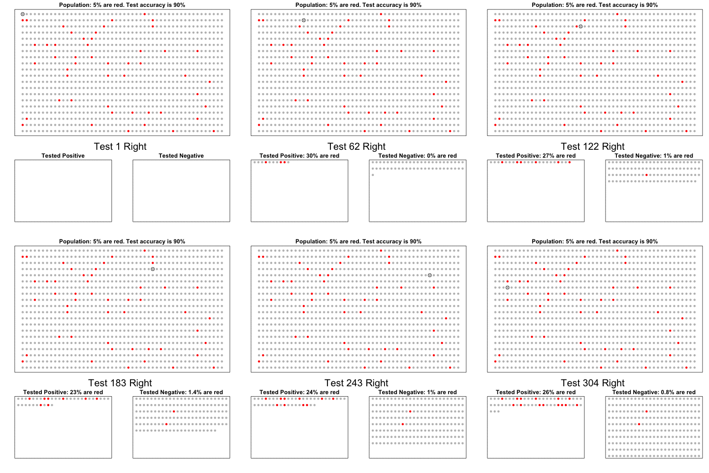
Because we are not plotting data but drawing a cartoon, the code is a bit complex and hard to read.
library(animation)
set.seed(2)
prev <- 1/20
acc <- 0.90
N <- 20; M <- 50
N_sick <- round(N*M*prev)
x<-sample(c(rep(1, N_sick), rep(0, N*M - N_sick)))
cols <- c("grey","red")
people <- expand.grid(1:M,N:1)
people2 <- expand.grid(1:round(M/2),N:(round(N/2)+1))
cols1 <- cols[x+1]
cols2 <- rep(NA, nrow(people2))
count2 <- 1
cols3 <- rep(NA, nrow(people2))
count3 <- 1

i <- 1
maxCount <- nrow(people2) + 1
saveGIF({
  while(count2<=maxCount & count3<=maxCount){
    test <- sample(100,1)
    min <- round(100*acc)
    rafalib::mypar()
    layout(matrix(c(1,2,1,3),2,2), heights = c(1.75,1))
    plot(people, col=cols1, pch=16, xaxt="n", yaxt="n", xlab="", ylab="",
         main=paste0("Population: ",round(mean(x)*100),"% are red. ",
                     "Test accuracy is ", round(acc*100),"%"))
    if(test>min){
      axis(side=1, M/2, paste("Test",i,"Wrong"), col="red", tick=FALSE,
           cex.axis=3,line=1)
      } else{
        axis(side=1, M/2, paste("Test",i,"Right"), col="black", tick=FALSE,
             cex.axis=2,line=1)
      }
    points(people[i,], pch=1, cex=1.5)
    if(all(is.na(cols2))){
      plot(people2, type="n", pch=16, xaxt="n", yaxt="n", xlab="", ylab="",
           main="Tested Positive")
      } else{
        plot(people2, col=cols2, pch=16, xaxt="n", yaxt="n", xlab="", ylab="",
             main=paste0("Tested Positive: ",
                         round(mean(cols2=="red",na.rm=TRUE)*100),"% are red"))
      }
    if(all(is.na(cols3))){
      plot(people2, type="n", pch=16, xaxt="n", yaxt="n", xlab="", ylab="",
           main="Tested Negative")
      } else{
        plot(people2, col=cols3, pch=16, xaxt="n", yaxt="n", xlab="", ylab="",
             main=paste0("Tested Negative: ",
                         round(mean(cols3=="red",na.rm=TRUE)*100,1),
                         "% are red"))
      }
    outcome <- ifelse(x[i]==1, as.numeric(test<=min), as.numeric(test>min))
    if(outcome==0) {
      cols3[count3] <- cols1[i]
      count3<-count3+1
      } else {
        cols2[count2] <- cols1[i]
        count2<-count2+1
      }
    i<-i+1
    }
  },'bayes.gif', interval = .1)
Pacman
Finally, I made this plot to show the only instance in which pie charts are useful.

The code fits in a tweet.