I’m co-teaching a data science class at Johns Hopkins with John Muschelli. I gave the lectures on EDA and he just gave a lecture on how to create an “expository graph”. When we teach the class an exploratory graph is the kind of graph you make for yourself just to try to understand a data set. An expository graph is one where you are trying to communicate information to someone else.
When you are making an exploratory graph it is usually simple, with no axes, legends, fancy colors, or other effort to make it pretty, understandable and clear. John has a great blog post on how to build up a figure that is expository.
Recently I gave a talk at McGill University and needed to create a plot for the talk. I figured one more example is always better for everything, so I thought I’d go through my process here.
I wanted to show the p-value distribution from the tidy-pvals package. So first I loaded the data:
I knew I wanted to use the ggridges package so I read the docs and started with the easiest version:
allp %>%
  ggplot(aes(x = pvalue, y = field)) +
    geom_density_ridges()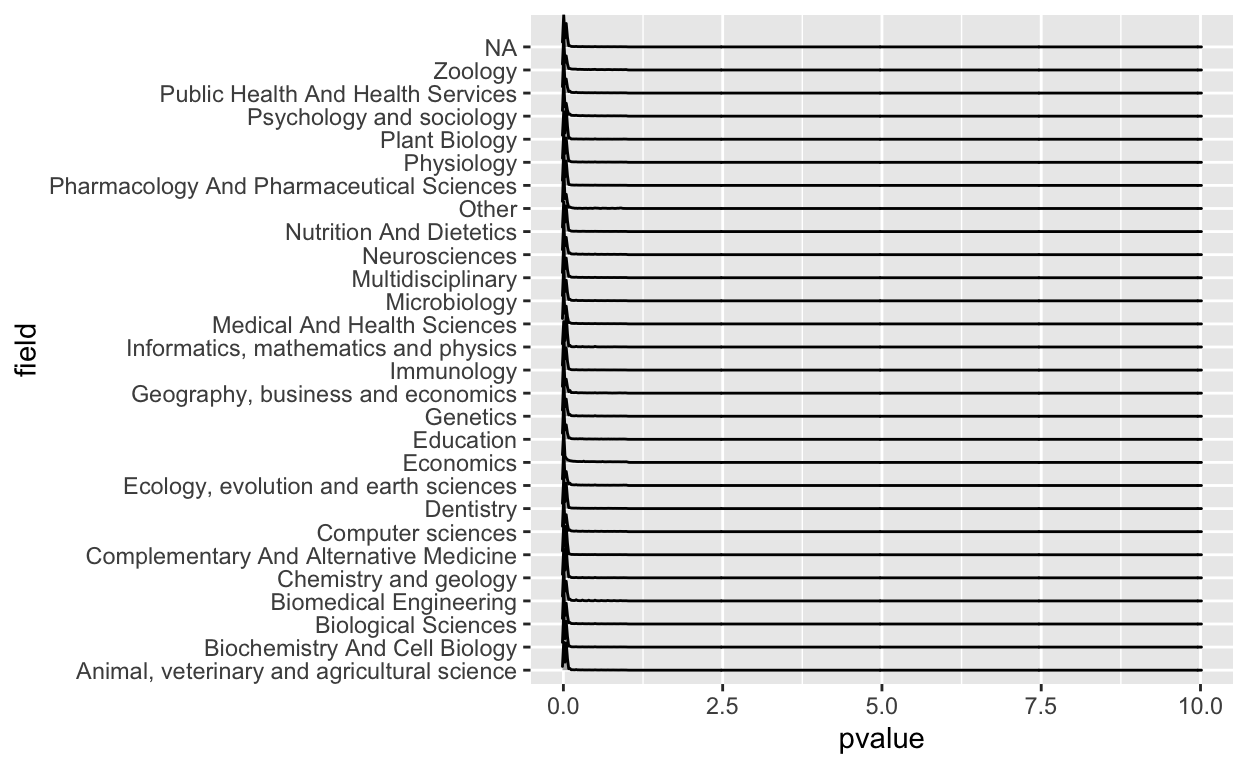
Right away I saw there were some problems here. First of all, clearly a p-value greater than one shouldn’t be in there, so that was a mistake. I also don’t like that you can’t really see the values because most of the action is near zero.
So let’s fix the x-axis a bit. I spent a few minutes fiddling and decided I just wanted to see the values between 0 and 0.25.
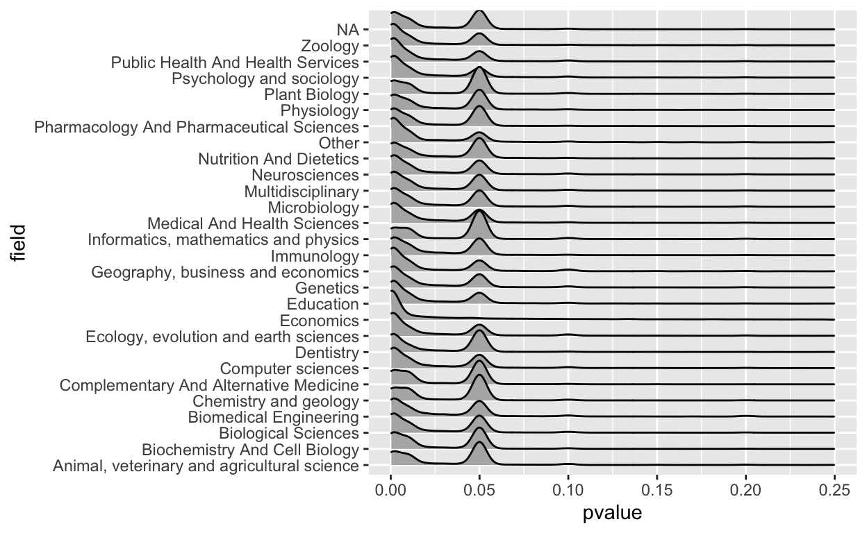
Ok that’s better, but I don’t really like the grey background so let’s pick a different background color
allp %>%
  ggplot(aes(x = pvalue, y = field)) +
    geom_density_ridges() +
xlim(c(0,0.25)) +
theme_ridges(grid = FALSE)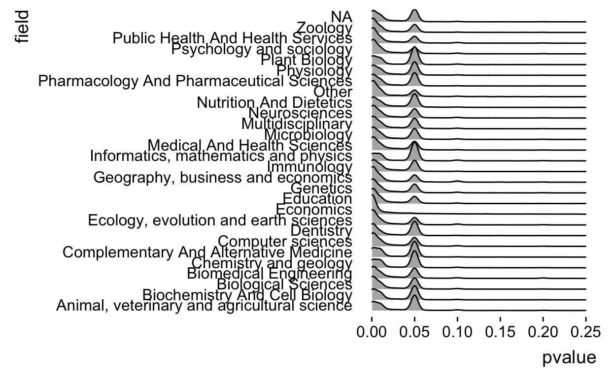
That’s a bit prettier, but we see that field is sometimes NA so we need to remove those values.
allp %>%
  filter(!is.na(field)) %>%
  ggplot(aes(x = pvalue, y = field)) +
    geom_density_ridges() +
  xlim(c(0,0.25)) +
  theme_ridges(grid = FALSE)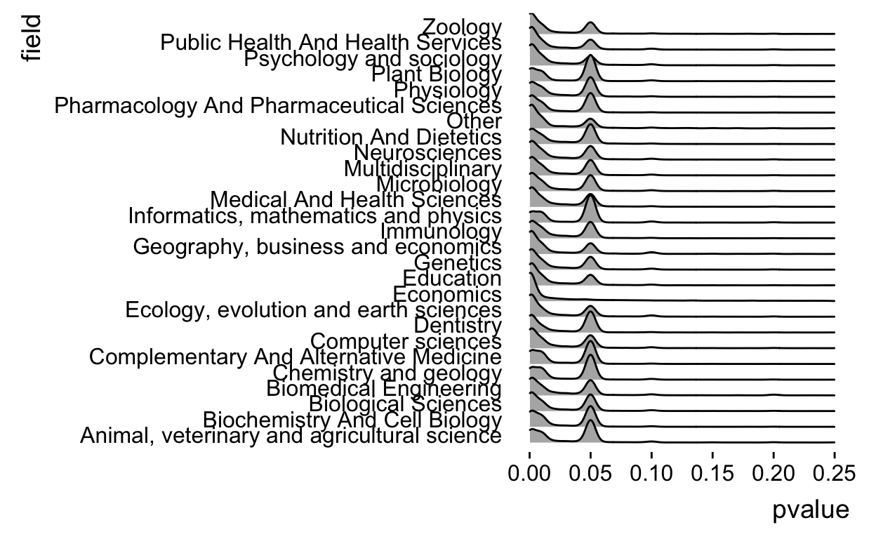
And actually the density plots are a little weird for p-values, lets see if we can turn them into something a little more like a histogram, which I think fits this data type better. To do that we have to change the parameters in geom_density_ridges.
allp %>%
  filter(!is.na(field)) %>%
  ggplot(aes(x = pvalue, y = field)) +
    geom_density_ridges(stat = "binline") +
  xlim(c(0,0.25)) +
  theme_ridges(grid = FALSE)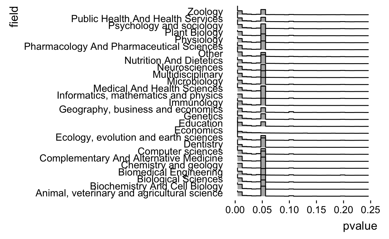
Ok but I think it would look better if it was a little bit higher resolution, let’s up the number of bins
allp %>%
  filter(!is.na(field)) %>%
  ggplot(aes(x = pvalue, y = field)) +
    geom_density_ridges(stat = "binline",bins=50) +
  xlim(c(0,0.25)) +
  theme_ridges(grid = FALSE)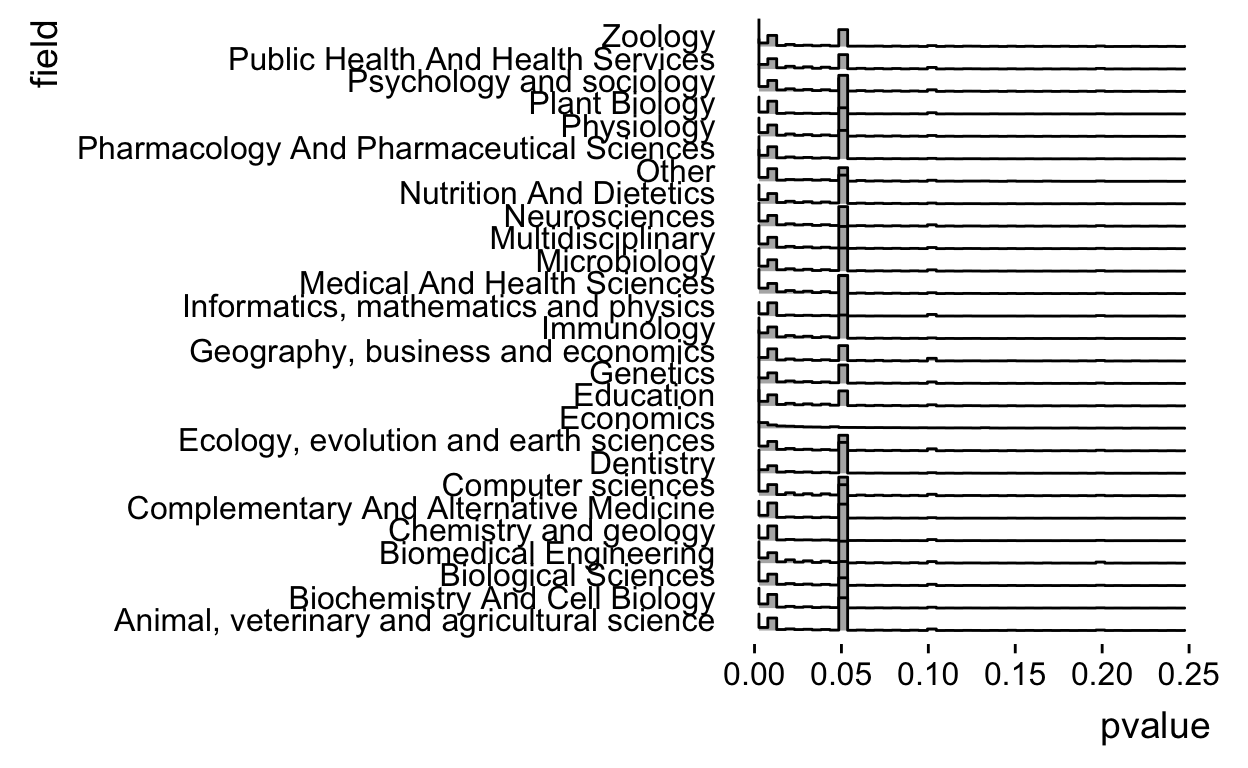
Ok but as people have pointed out the spike at 0.05 is due to censoring (p-values reported like \(P < 0.05\)). So let’s break it down by operator.
allp %>%
  filter(!is.na(field)) %>%
  ggplot(aes(x = pvalue, y = field,fill=operator)) +
    geom_density_ridges(stat = "binline",bins=50) +
  xlim(c(0,0.25)) +
  theme_ridges(grid = FALSE)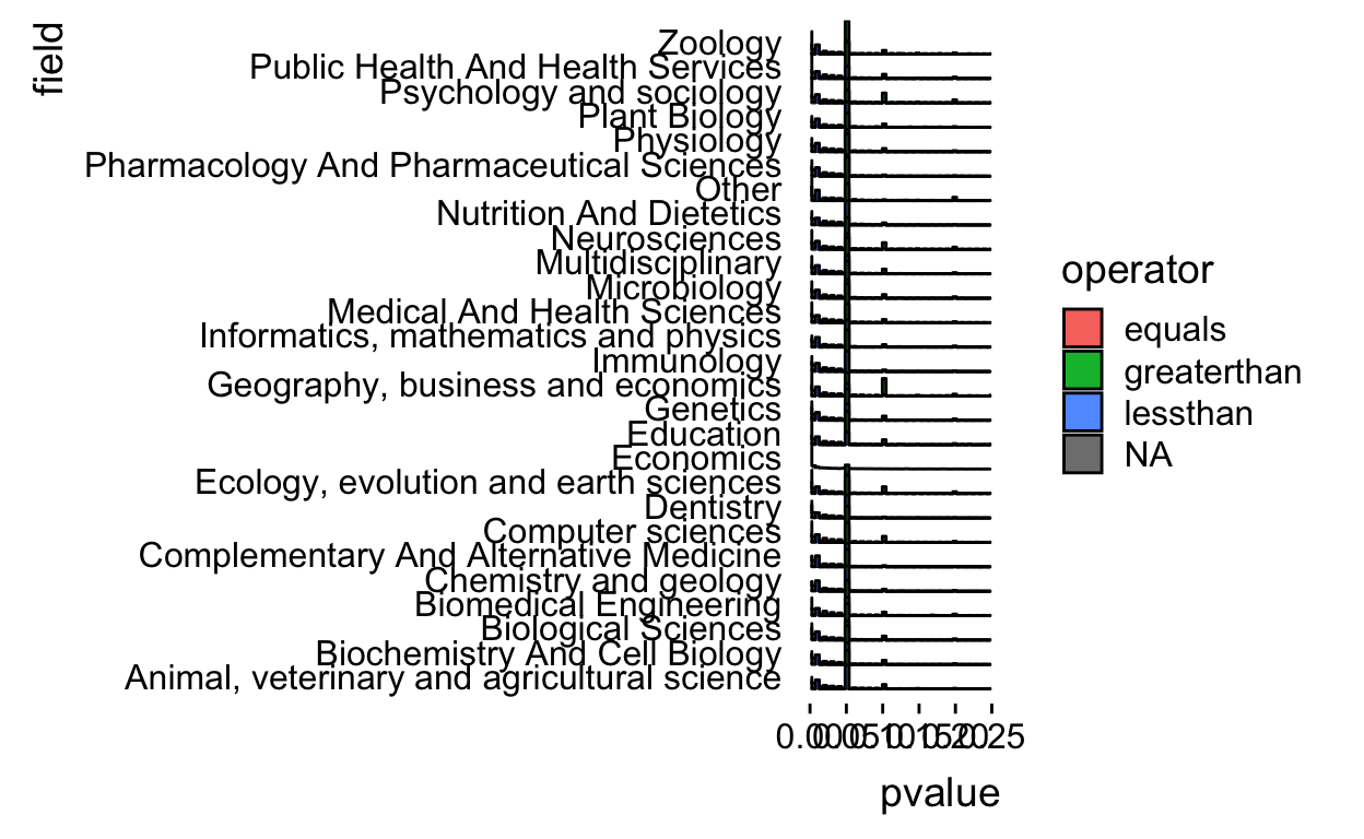
Ok there aren’t that many greater than p-values and it makes the plot messy so let’s drop those
allp %>%
  filter(!is.na(field)) %>%
  filter(operator != "greaterthan") %>%
  ggplot(aes(x = pvalue, y = field,fill=operator)) +
    geom_density_ridges(stat = "binline",bins=50) +
  xlim(c(0,0.25)) +
  theme_ridges(grid = FALSE)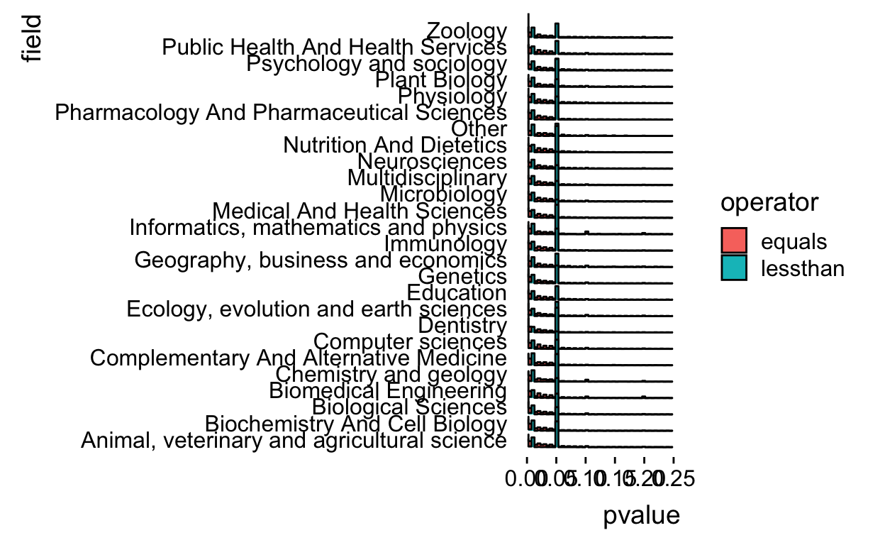
The histograms overlap a bit so let’s alpha blend the colors.
allp %>%
  filter(!is.na(field)) %>%
  filter(operator != "greaterthan") %>%
  ggplot(aes(x = pvalue, y = field,fill=operator)) +
    geom_density_ridges(stat = "binline",
                        bins=50,alpha=0.25) +
  xlim(c(0,0.25)) +
  theme_ridges(grid = FALSE)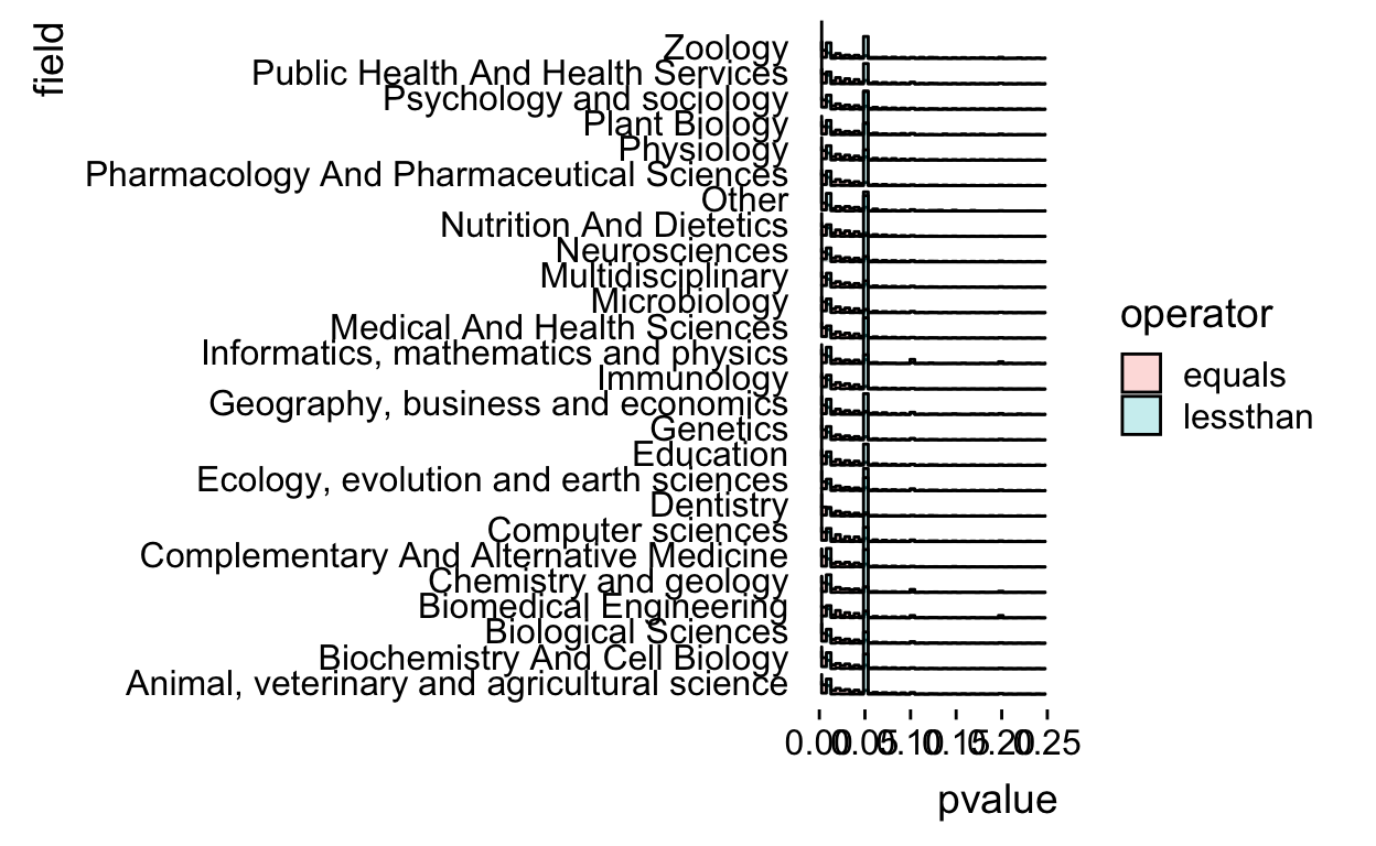
There is some funkiness in how the histogram bins are computed so I went to the internet and figured out I needed to set the boundary at 0 and make the bins be closed on the right.
allp %>%
  filter(!is.na(field)) %>%
  filter(operator != "greaterthan") %>%
  ggplot(aes(x = pvalue, y = field,fill=operator)) +
    geom_density_ridges(stat = "binline",
                        bins=50,alpha=0.25,
                        boundary=0,closed="right") +
  xlim(c(0,0.25)) +
  theme_ridges(grid = FALSE)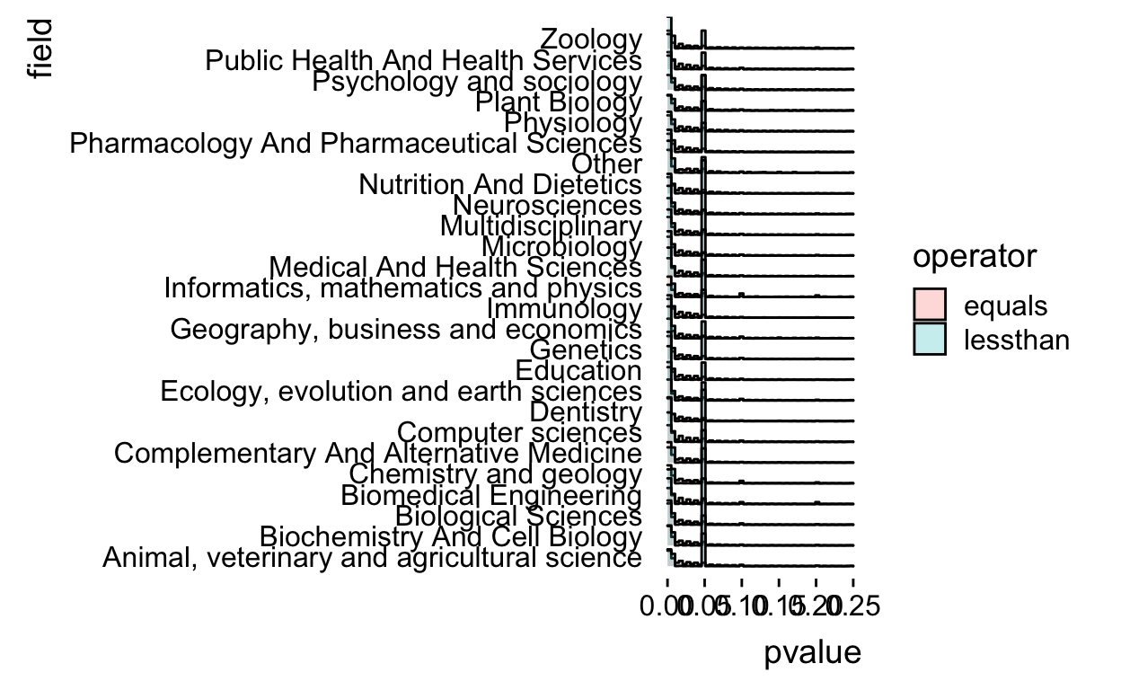
Now we make sure that there isn’t wasted space on the y-axis by using the expand argument.
allp %>%
  filter(!is.na(field)) %>%
  filter(operator != "greaterthan") %>%
  ggplot(aes(x = pvalue, y = field,fill=operator)) +
    geom_density_ridges(stat = "binline",
                        bins=50,alpha=0.25,
                        boundary=0,closed="right") +
  xlim(c(0,0.25)) +
  theme_ridges(grid = FALSE) +
  scale_y_discrete(expand=c(0,0))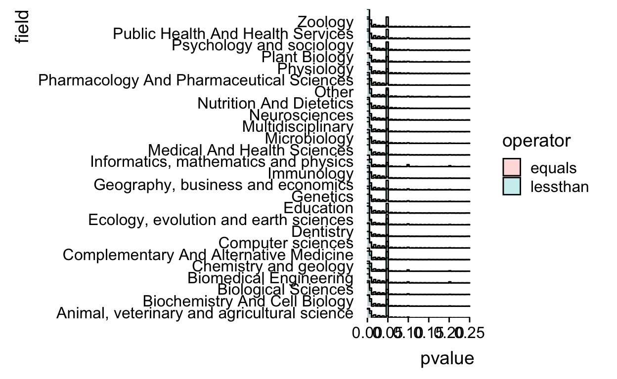
Remove the baseline from the plot for true ggridges coolness
allp %>%
  filter(!is.na(field)) %>%
  filter(operator != "greaterthan") %>%
  ggplot(aes(x = pvalue, y = field,fill=operator)) +
    geom_density_ridges(stat = "binline",
                        bins=50,alpha=0.25,
                        boundary=0,closed="right",
                        draw_baseline=FALSE) +
  xlim(c(0,0.25)) +
  theme_ridges(grid = FALSE) +
  scale_y_discrete(expand=c(0,0))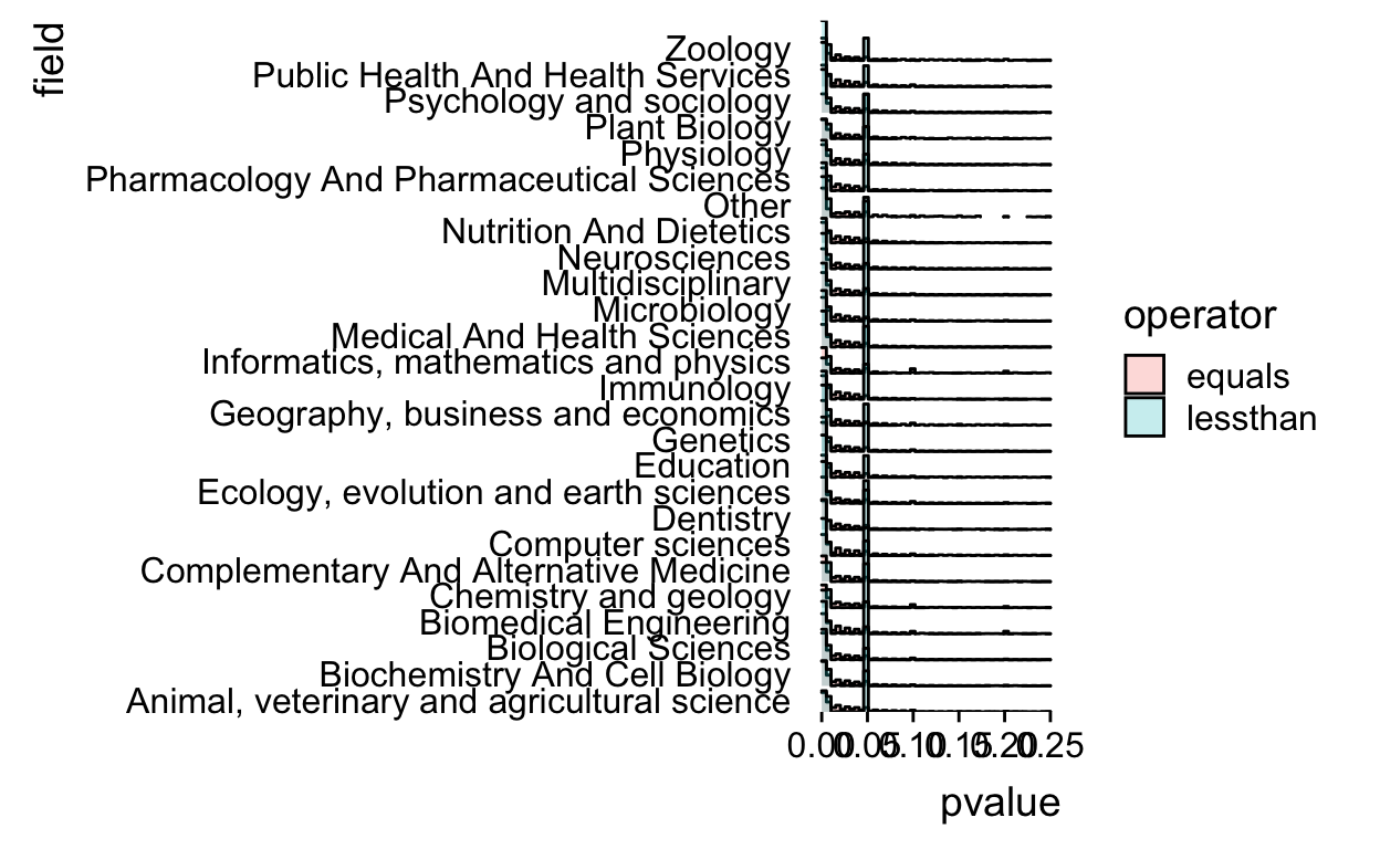
That’s definitely not a perfect plot, but it worked for my talk and was at least able to communicate a couple of the key points (about variation by field, variation by operator, and spikes at critical values).
If I was going beyond the talk I’d probably reduce the number of fields displayed or really increase the size of the plot. I’d probably make the bin width even smaller and I’d add a title. I’d also probably clean up the “greaterthan” and “lessthan” to be “Greater than” and “Less than”.
Regardless, I’m always surprised how much work it takes to go from an exploratory plot I’m just looking at myself to one I’d show to other people.