Late last Friday, the Puerto Rico Department of Health finally released monthly death count data for the time period following Hurricane Maria:
BREAKING: the Puerto Rico Health Department has buckled under pressure and released the number of deaths for each month, through May of 2018. In September 2017, when Hurricane Maria made landfall, there was a notable spike, followed by an even larger one in October. pic.twitter.com/3Irw1eUOTC
— David Begnaud (@DavidBegnaud) June 1, 2018
The news came three days after the publication of our paper describing a survey conducted to better understand what happened after the hurricane. We did not have access to these data and, after this announcement, we requested daily data. We received it on Tuesday. The data comes as a PDF file which we make public here. The code to extract the data is long and messy so we include it at the end of the post and only show the package loading part here.
The wrangling produces the object official:
head(official)# A tibble: 6 × 5
month day year deaths date
<dbl> <dbl> <dbl> <dbl> <date>
1 1 1 2015 107 2015-01-01
2 1 2 2015 101 2015-01-02
3 1 3 2015 78 2015-01-03
4 1 4 2015 121 2015-01-04
5 1 5 2015 99 2015-01-05
6 1 6 2015 104 2015-01-06Here I include an analysis showing that the newly released data confirms that the official death count of 64 is a gross underestimate and that, according to these data, the current count is closer to 2,000 than 64.
The raw data
Here is a plot of the daily data for 2017 and 2018:
official %>% filter(year >= 2017 & deaths > 0) %>%
  ggplot(aes(date, deaths)) +
  geom_point(alpha = 0.5) +
  geom_vline(xintercept = make_date(2017,09,20), lty=2, col="grey") +
  scale_x_date(date_labels = "%b", date_breaks = "1 months") +
  theme(axis.text.x = element_text(angle = 90, hjust = 1)) +
  ggtitle("Raw data for 2017 and 2018")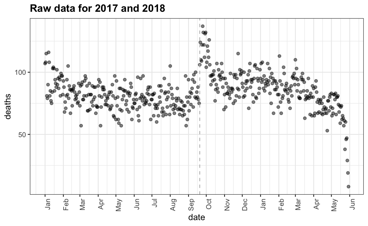
We clearly see the effects of the hurricane: there is a jump of between 25-50 deaths per day for about 2 weeks. It also seems that the 3-4 following months show a higher rate than expected. But this is hard to discern due to the seasonal trend: more deaths in the winter. The plot also shows that deaths have not yet been tallied for the last couple of weeks. So we restrict the analysis and exclude data from past April 15th.
Adjusting for an aging population, seasonal effect, and depopulation
We start by estimating the population size. We know that Puerto Rico has been losing population for the last 10 years. This file includes population size estimates. We also know that many people left the island after the hurricane. Teralytics tried to estimate this using data collected from cell phones. We extracted their estimates (by hand) from this post. We then interpolated to generate an estimate of population for the days in our data:
tmp <- bind_rows(
  data.frame(date = make_date(year = 2010:2017, month = 7, day = 2),
             pop = population_by_year$pop),
  data.frame(date = make_date(year=c(2017,2017,2017,2017,2018,2018),
                              month=c(9,10,11,12,1,2),
                              day = c(19,15,15,15,15,15)),
             pop = c(3337000, 3237000, 3202000, 3200000, 3223000, 3278000)))
tmp <- approx(tmp$date, tmp$pop, xout=official$date, rule = 2)
predicted_pop <- data.frame(date = tmp$x, pop = tmp$y)
p1 <- qplot(date, pop, data=predicted_pop, ylab = "population", geom = "line")
To account for differences in population sizes we compute rates.
Because the population is getting older, we also need to adjust for a year effect. To be able to compare 2017 to previous years, we use only the days before September 20 to compute a yearly median rate. Because we have no post hurricane data for 2018, we also assume that 2018 has the same rate as 2017.
| year | year_rate |
|---|---|
| 2015 | 8.176414 |
| 2016 | 8.387966 |
| 2017 | 8.749981 |
| 2018 | 8.749981 |
With these estimates in place, we can now estimate a seasonal trend using 2015 and 2016 data. We do this by fitting a periodic smooth trend using loess:
avg <- official %>% filter(year(date) < 2017 & !(month==2 & day == 29)) %>%
  left_join(population_by_year, by = "year") %>%
  group_by(month,day) %>%
  summarize(avg_rate = mean(rate - year_rate), .groups = "drop") %>%
  ungroup()
day <- as.numeric(make_date(1970, avg$month, avg$day)) + 1
xx <- c(day - 365, day, day + 365)
yy<- rep(avg$avg_rate, 3)
fit <- loess(yy ~ xx, degree = 1, span = 0.15, family = "symmetric")
trend <- fit$fitted[366:(365*2)]
trend <- data.frame(month = avg$month, day = avg$day, trend = trend)
official <- official %>% left_join(trend, by = c("month", "day"))
Here is what the estimate population size and seasonal trend look like:
p2 <- official %>%
  filter(date >=ymd("2017-01-01") & date < ymd("2018-01-01")) %>%
  ggplot(aes(date, trend)) +
  geom_line() +
  scale_x_date(date_labels = "%b", date_breaks = "1 months") +
  theme(axis.text.x = element_text(angle = 90, hjust = 1)) +
  ggtitle("Death rate trend in PR")
grid.arrange(p1, p2, ncol=2)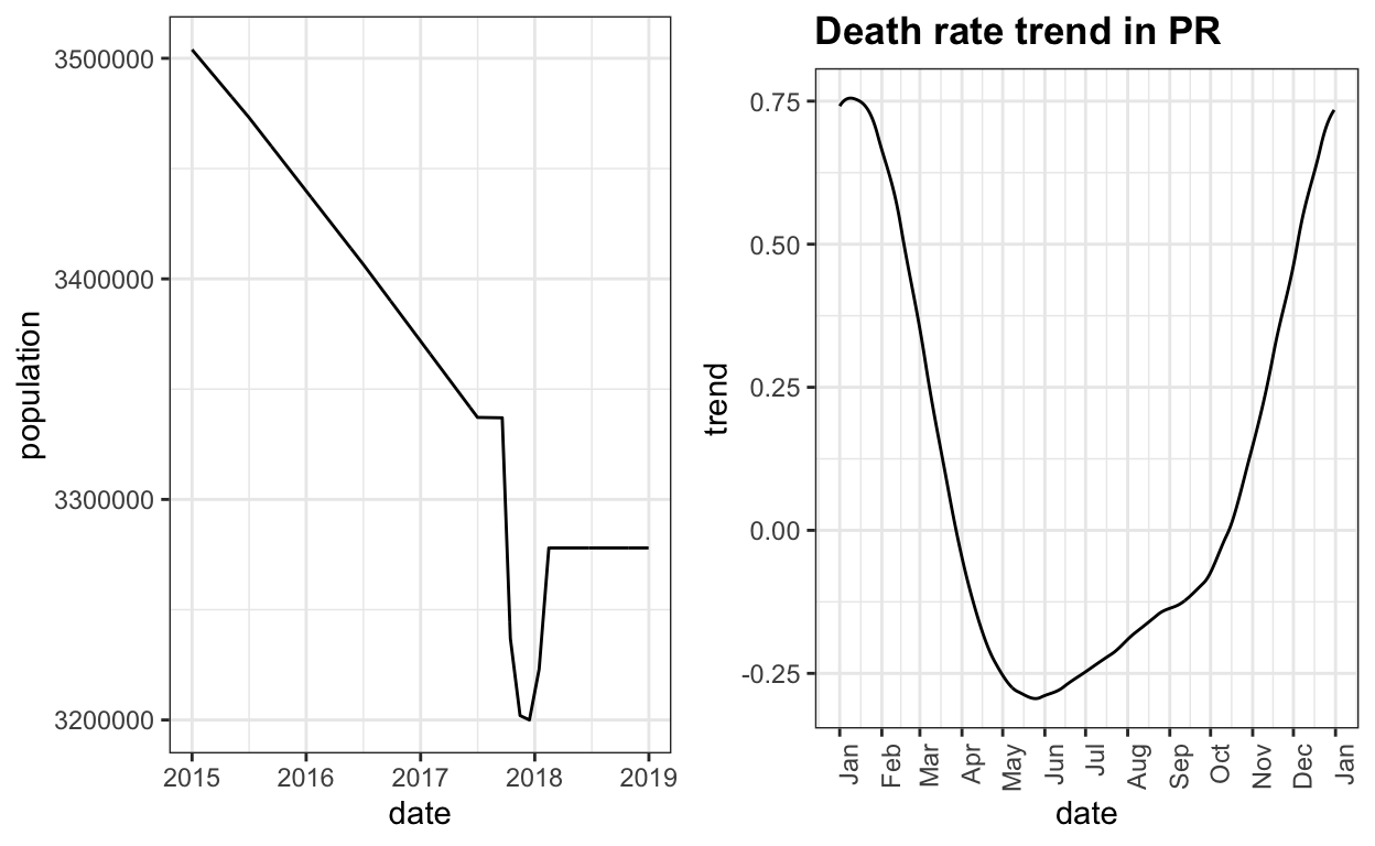
Adjusted Death Rates
With all this in place, we can now adjust the raw count data and compute an observed minus expected death rate. We use loess, with a break-point at September 20, 2017, to estimate a smooth version of the excess death rate as a function of time.
after_smooth <- official %>%
  filter(date >=ymd("2017-01-01") & date < ymd("2017-09-20")) %>%
  mutate(y = rate - year_rate -  trend, x = as.numeric(date)) %>%
  loess(y ~ x, degree = 2, span = 2/3, data = .)
before_smooth <- official %>%
  filter(date >=ymd("2017-09-20") & date < ymd("2018-04-15")) %>%
  mutate(y = rate - year_rate -  trend, x = as.numeric(date)) %>%
  loess(y ~ x, degree = 2, span = 2/3, data = .)
tmp <- official %>%
  filter(date>=ymd("2017-01-01") & date < ymd("2018-04-15")) %>%
  mutate(smooth = c(after_smooth$fitted, before_smooth$fitted),
         se_smooth = c(predict(before_smooth, se=TRUE)$se,
                       predict(after_smooth, se=TRUE)$se))
Here is what the excess death rate looks like:
tmp %>% mutate(diff = rate - year_rate - trend) %>%
  ggplot(aes(date, diff)) +
  geom_point(alpha=0.5) +
  geom_ribbon(aes(date,
                  ymin = smooth - 1.96 * se_smooth,
                  ymax = smooth + 1.96 * se_smooth),
              fill="blue", alpha = 0.25) +
  geom_line(aes(date, smooth), col = "blue") +
  scale_x_date(date_labels = "%b", date_breaks = "1 months") +
  theme(axis.text.x = element_text(angle = 90, hjust = 1)) +
  ggtitle("Increase in death rate") +
  ylab("Observed rate minus expected rate") +
  geom_hline(yintercept = 0, lty = 2)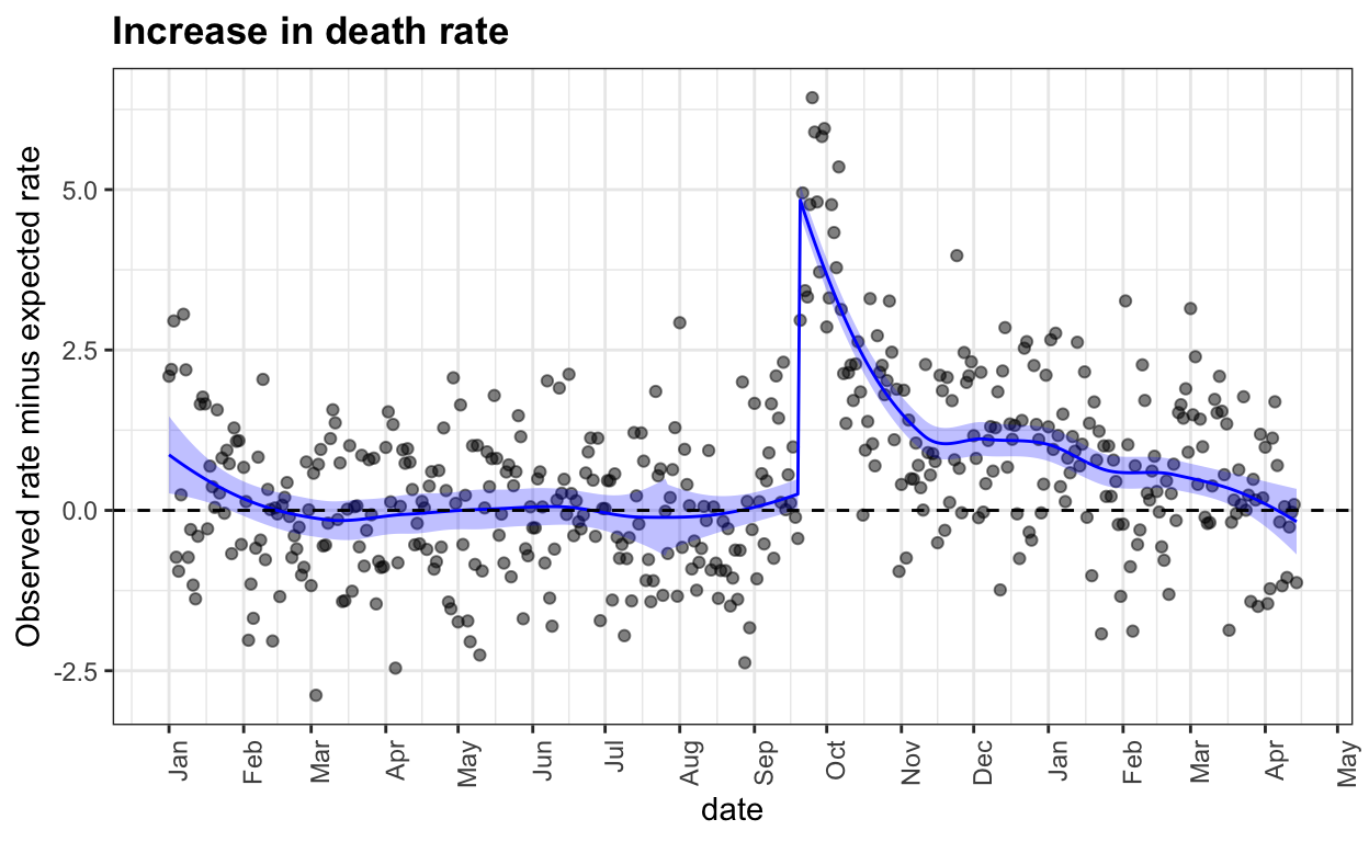
We can now clearly see that following the big spike right after the hurricane, the death rate continued to be higher than expected, by about 10% until past December.
This gives us the excess death rate. To compute an excess count we need to plug in a population size and a baseline rate. If we assume all of 2017 had the same population, the pre-hurricane yearly effect and seasonal trend as other years we get the following excess deaths by date:
the_pop <- filter(population_by_year, year == 2016) %>% .$pop
tmp %>%
  filter(date >=ymd("2017-09-20")) %>%
  mutate(diff = rate - year_rate - trend,
         raw_cdf = cumsum(diff*the_pop/1000/365),
         smooth_cdf =cumsum(smooth*the_pop/1000/365)) %>%
  ggplot() +
  geom_step(aes(date, raw_cdf)) +
  scale_x_date(date_labels = "%b", date_breaks = "1 months") +
  theme(axis.text.x = element_text(angle = 90, hjust = 1)) +
  ggtitle("Excess deaths by date") +
  ylab("Excess death estimate") +
  geom_hline(yintercept = 64, lty=2, col="grey")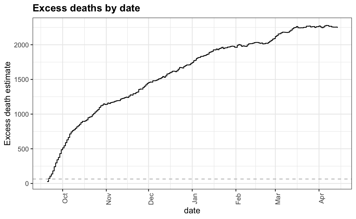
We can see that 64 deaths were reached during the first few days and 2,000 deaths are reached around February.
One could argue that these assumptions are not optimal because, for example, young people may have left at a higher rate past the hurricane making the expected rate a bit higher. I encourage others to change the assumptions and re-run the code to see how the final results change.
Code for wrangling PDF
Here is the code to extract the data from the PDF file:
library(pdftools)
filename <- "https://github.com/c2-d2/pr_mort_official/raw/master/data/RD-Mortality-Report_2015-18-180531.pdf"
txt <- pdf_text(filename)
library(tidyverse)
library(gridExtra)
dslabs::ds_theme_set()
library(stringr)
library(lubridate)
dat <- lapply(seq_along(txt), function(i){
  s <- str_replace_all(txt[i], "\\*.*", "") %>%
    str_remove_all("Fuente: Registro Demográfico - División de Calidad y Estadísticas Vitales") %>%
    str_replace_all("Y(201\\d)\\*?", "\\1") %>%
    str_replace("SEP", "9") %>%
    str_replace("OCT", "10") %>%
    str_replace("NOV", "11") %>%
    str_replace("DEC", "12") %>%
    str_replace("JAN", "1") %>%
    str_replace("FEB", "2") %>%
    str_replace("MAR", "3") %>%
    str_replace("APR", "4") %>%
    str_replace("MAY", "5") %>%
    str_replace("JUN", "6") %>%
    str_replace("JUL", "7") %>%
    str_replace("AGO", "8") %>%
    str_replace("Total", "@")

  tmp <- str_split(s, "\n") %>%
    .[[1]] %>%
    str_trim %>%
    str_split_fixed("\\s+", 50) %>%
    .[,1:5] %>%
    as_tibble()
  colnames(tmp) <- tmp[3,]
  tmp <- tmp[-(1:3),]
  j <- which(tmp[,1]=="@")
  if(colnames(tmp)[1]=="2") { ## deal with february 29
    k <- which(tmp[[1]]==29)
    the_number <- unlist(tmp[k,-1])
    the_number <- the_number[the_number!=""]
    tmp[k, colnames(tmp)!="2016" & colnames(tmp)!="2"] <- "0"
    tmp[k, "2016"] <- the_number
  }
  tmp <- tmp %>% slice(1:(j-1)) %>% mutate_all(funs(as.numeric)) %>%
    filter(!is.na(`2015`) & !is.na(`2016`) & !is.na(`2017`)  & !is.na(`2017`))
  tmp <- mutate(tmp, month = as.numeric(names(tmp)[1]))
  names(tmp)[1] <- "day"
  tmp <- tmp[,c(6,1,2,3,4,5)]
  ones <- which(tmp$day==1) ##1 2 3 4 appears due to graph... let's take it out
  if(length(ones)>1) tmp <- tmp[-ones[-1],]
  if(any(diff(tmp$day)!=1)) stop(i) ## check days are ordered
  ##check if negative. this means a black was left and the diff between 2016 and 0 was used!
  tmp[tmp<0] <- NA
  pivot_longer(tmp, c("2015", "2016", "2017", "2018"),
               names_to = "year", values_to = "deaths") %>%
    mutate(year = as.numeric(year))
})
official <- do.call(rbind, dat) %>%
  arrange(year, month, day) %>%
  filter(!(month==2 & day==29 & year != 2016))
## add date
official <-official %>% mutate(date = ymd(paste(year, month, day,"-")))