There are often discussions within the data science community about which tools are best for doing data science. The most recent iteration of this discussion is the so-called “First Notebook War”, which is well-summarized by Yihui Xie in his blog post (it is a great read).
One thing that I have found missing from many discussions about tooling in data analysis is an acknowledgment that data analysis tends to advance through different phases and that different tools can be more or less useful in each of those phases. In fact, a tool that is very useful in one phase can be less useful or even detrimental in other phases. Yihui touches on this in his blog post and my goal here is to expand on this idea here.
A Double Diamond for Data Analysis
One image that is commonly found in the literature on design thinking is the “double diamond”, which is a model for the design process. I think this model can be usefully adapted to help us think about data analysis and my best representation is here (apologies for the scribble).
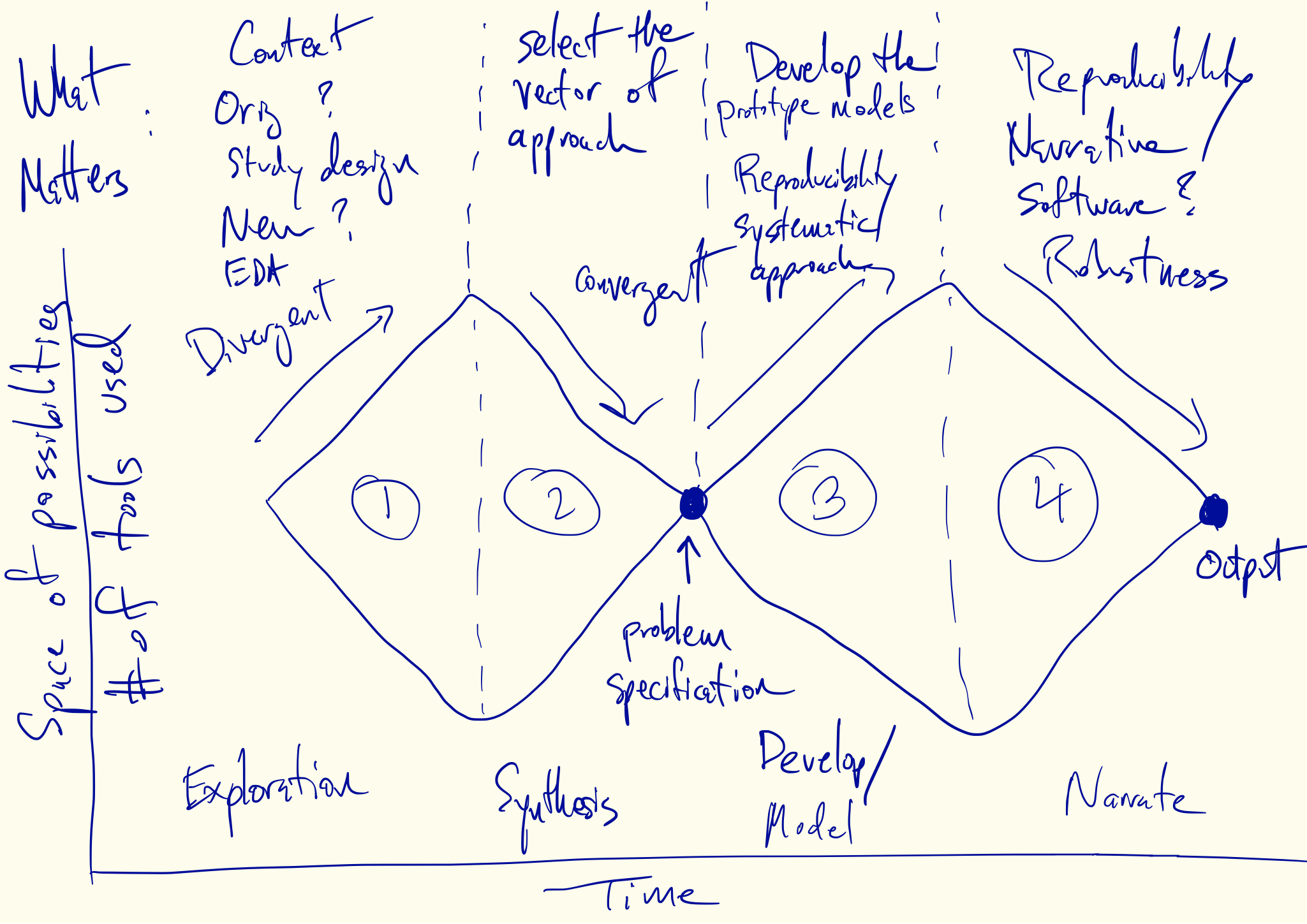
In this figure I’ve identified four phases of data analysis that alternate between divergent and convergent forms of thinking. The x-axis is roughly “time” or the timeline of the analysis. The y-axis can be thought of as indicating the range of possibilities. Okay, it’s not exactly a numerical graph, but you get the idea. The wide parts of each diamond are meant to indicate that there are many possibilities under consideration while the narrow “choke points” indicate that there should be one or a few things under consideration.
How does all this relate to data analysis? Let’s first take a closer look at the four phases.
Phase 1: Exploration
The goal of Phase 1 is to explore the possibilities inherent in the data. This part is familiar to all data analysts.
The dataset lands in your lap and there are a lot of things to do and a lot of questions to answer. Did you get the right dataset? Are all the data there? Are they in the right format for analysis? This is often where a lot of data wrangling occurs. We must consider what question is being asked and whether the data are appropriate for that question (at least without making unreasonable assumptions). We might also consider what question motivated the creation of the data.
At this point we may think we have a question to ask, but usually that question is only vaguely formed or is in need of further information. Here is where we need the data to help us out. For example, an important general question is “Can the data even be used to answer my question?” We need to look at the data to figure that out. How we look at the data will vary across people, context, and many other factors. Regardless of the specific situation, we likely will need to make lots and lots of plots, summaries, and tables. We’ll need to look at the data, perhaps even in a program like Excel, and just get a sense of the data.
This phase of analysis is highly divergent, with many possibilities being considered for how to ask the question and what approach to take. In my experience, I’m making tons of plots and looking at various transformations of individual variables and bivariate relationships. I’ve never bothered to count, but it wouldn’t surprise me if there were thousands of plots made in this phase. This is the “sketching” phase of analysis, figuratively speaking, but sometimes literally speaking. Sketches of plots or tables are often a useful planning device.
This phase of analysis is almost always fun, because we are opening up the possibilities. But all good things must eventually come to an end.
Phase 2: Refining the Problem
Phase 2 is challenging because it involves making decisions and choices. Nobody likes to do that. Inevitably, most of the work you did in Phase 1 will be left on the cutting room floor. You might love all your children equally but you still need to pick a favorite. The reason is nobody has the resources to pursue every avenue of investigation. Furthermore, pursuing every avenue would likely not be that productive. You are better off sharpening and refining your question. This simplifies the analysis in the future and makes it much more likely that people (including you!) will be able to act on the results that you present.
This phase of analysis is convergent and requires synthesizing many different ideas into a coherent plan or strategy. Taking the thousands of plots, tables, and summaries that you’ve made and deciding on a problem specification is not easy, and to my surprise, I have not seen a lot of tools dedicated to assisting in this task. Nevertheless, the goal here is to end up with a reasonably detailed specification of what we are trying to achieve and how the data will be used to achieve it. It might be something like “We’re going to fit a linear model with this outcome and these predictors in order to answer this question” or “We’re building a prediction model using this collection of features to optimize this metric”.
In some settings (such as in consulting) you might need to formally write this specification down and present it to others. At any rate, you will need to justify it based on your exploration of the data in Phase 1 and whatever outside factors may be relevant. Having a keen understanding of your audience becomes relevant at the conclusion of this phase.
Phase 3: Model Development
This phase is the bread and butter of most statisticians and statistics education programs. Here, we have a reasonably well-specified problem, a clear question, an appropriate dataset, and we’re going to engineer the solution. But that doesn’t mean we just push a button and wait for the result to come out. For starters, what will the results look like? What summaries do we want to produce and how will they be presented? Having a detailed specification is good, but it’s not final. When I was a software engineer, we often got highly detailed specifications of the software we were supposed to build. But even then, there were many choices to make.
Thus begins another divergent phase of analysis, where we typically build models and gauge their performance and robustness. This is the data analyst’s version of prototyping. We may look at model fit and see how things work out relative to our expectations set out in the problem specification. We might consider sensitivity analyses or other checks on our assumptions about the world and the data. Again, there may be many tables and plots, but this time not of the data, but of the results. The important thing here is that we are dealing with concrete models, not the rough “sketches” done in Phase 1.
Because the work in this phase will likely end up in some form in the final product, we need to develop a more formal workflow and process to track what we are doing. Things like version control play a role, as well as scriptable data analysis packages that can describe our work in code. Even though many aspects of this phase still may not be used, it is important to have reproducibility in mind as work is developed so that it doesn’t have to be “tacked on” after the fact (an often painful process).
Phase 4: Narration
In the final convergent phase of data analysis, we must again make choices amongst the many pieces of work that we did in Phase 3. We must choose amongst the many models and results and decide what will make it into the final product, whether it is a paper, a report, a web site, or a slide deck.
In order to make these choices, it is useful to develop a narrative of the analysis. Building the narrative is dimension reduction for results and it allows you to choose from the various results the ones that follow your narrative. Simply “presenting the data” is first, not really possible, and second, not desirable. It’s information overload and rarely allows the audience to make an intelligent conclusion. Ultimately, the analyst must decide on a narrative and select the various results that tell that story.
Selecting a narrative doesn’t mean that everything else is thrown out. There are often many parts of an analysis that cannot make it into the main product but can be put in some form of “supplementary materials”. For example, FiveThirtyEight.com doesn’t put its election statistical model on its web site, it puts it in a PDF document that you can download separately. In many scientific papers, there can be dozens of tables in the supplementary materials that didn’t make it into the paper. Many presenters often have backup slides hidden at the end of the deck in case there are questions. Some people may disagree with the choice of narrative, but that doesn’t eliminate the need for choices to be made.
Implications
At this point it’s worth recalling that all models are wrong, but some are useful. So why is this model for data analysis useful? I think there are a few areas where the model is useful as an explanatory tool and for highlighting where there might be avenues for future work.
Decision Points
One thing I like about the visual shape of the model is that it highlights two key areas–the ends of both convergent phases–where critical decisions have to be made. At the end of Phase 2, we must decide on the problem specification, after sorting through all of the exploratory work that we’ve done. At the end of Phase 4, we must decide on the narrative that we will use to explain the results of an analysis.
At both decision points, we must balance a set of competing priorities and select from a large number of outputs to create a coherent product. When developing the problem specification, we must avoid the desire to say “We’re going to do all the things” and when producing the final product we must avoid the “data dump” where we shift the burden of interpretation and distillation on to the audience.
In my experience, data analysts really enjoy the divergent phases of analysis because no choices have to be made. In fact, in those phases we’re doing the opposite of making choices–we’re trying out everything. But the convergent phases cannot be avoided if we want to produce good data analysis.
Tooling
When it comes to discussions about tooling in data science it’s useful to preface such discussion with an indication of which phase of data analysis we are talking about. I cannot think of a single tool that is simultaneously optimal for every phase of analysis. Even R is sub-optimal for Phases 2 and 4 in my opinion. For example, when developing data visualizations for presentation, many people resort to tools like Adobe Illustrator.
I find most debates on tooling to be severely confounded by a lack of discussion about what phase of analysis we are focusing on. It can be difficult for people to accept that a given tool may be optimal for one phase but detrimental in another phase. I think the four-phase model for analysis can explain some of the recent “debates” (a.k.a flame wars) on tooling in the data science world.
Let’s start with notebooks. I think the issue here is essentially that notebooks can be useful for Phase 1 but potentially dangerous for Phase 3. Reproducibility is a critical consideration for developing the final results, but is less important when exploring the data in Phase 1. The need for consistent state and in-order execution of commands is more important in Phases 3 than in Phase 1 when lots of ideas are being tried and will likely be thrown out. There’s no either-or decision to be made here with regard to notebooks. It just depends on what phase of analysis you’re in. I generally prefer R Markdown but can see the attractiveness of notebooks too.
Consider the age-old base graphics vs. ggplot2 debate. This is another debate confounded by the phases of data analysis. In the divergent phases (like Phase 1), there is a need to do things very quickly so that good ideas can be discovered and bad ideas can be discarded. Having a system like ggplot2 that allows you to rapidly “sketch” out these ideas is important. While the base graphics system gives you fine control over every aspect of a plot, such a “feature” is really a detriment in Phase 1 when you’re exploring the data. Nathan Yau seems to edge towards base graphics but I think this is largely because he is considering developing “final” data presentations in Phase 4. If you look at the visualizations on his web page, they are akin to works of art. They are not sketches. When developing those kinds of visualizations, having fine control over every detail is exactly what you want.
Education
In my experience as both a student and a teacher, statistical education tends to focus on Phases 3 and 4 of the data analysis process. These phases are obviously important and can be technically demanding, making them good things to emphasize in a statistics program. In the classroom, we typically start with a reasonably well-specified problem and proceed with engineering the solution. We discuss the many options for developing the solution and the various strengths and weaknesses of those options. Because the work in Phase 3 ends up in the final results, it’s important to get this phase right.
When getting a graduate degree, Phases 1 and 2 are usually taught as part of developing the thesis using an apprenticeship model with an advisor (“just watch what I do for a few years”). Some good programs have courses in exploratory data analysis that fall squarely into Phase 1, but I don’t think I’ve ever seen a course that covers Phase 2. Phase 4 is sometimes covered in visualization courses which discuss the design process for good data presentation. There are also a number of good books that cover this phase. But we rarely discuss the role of developing a coherent narrative of an analysis in the classroom. Usually, that is covered using an apprenticeship approach.
Data Analytic Errors
One general problem that occurs when I see others do data analysis is confusing the different phases. It’s common for people to think that they are in one phase when they’re really in another. This can lead to data analytic problems and even mistakes.
Confusing Phase 3 for Phase 1 is arguably the most common and the most dangerous problem that one can encounter in science. In Phase 1 we are developing the specification of the problem, but in Phase 3 that specification should be more or less locked down. If we discover something else interesting in Phase 3, we cannot pretend like that’s what we meant to conclude in Phase 1. That’s a recipe for p-hacking. Phase 1 should be broad and exploratory with the data. But once you’ve decided on a problem in Phase 2, Phases 3 and 4 should be solely dedicated to solving that problem. Changing up the problem in mid-stream in Phases 3 and 4 is often tempting but almost always a mistake.
A related problem is confusing Phase 2 with Phase 4. I have observed people who explore the data extensively, making quick plots, sketches, and summaries, and then immediately draw a conclusion like “X causes Y” or “A is associated with B”. Essentially, they jump from Phase 1 straight to Phase 4. This is problematic because often in the exploratory process we only look at rough sketches, often just bivariate plots or 2x2 tables which reveal strong relationships. Making inferences from this kind of exploratory work can be misleading without carefully considering second order factors like confounding or the effects of missing data. Often, those issues are more easily dealt with when using formal models or more detailed visualization.
Thinking through and formally specifying a problem in Phase 2 can often help to solve problems without having to fit a single model. For example, if exploratory analysis suggests strongly that missing data is missing completely at random, then there may be no need to model the missing data process in Phase 3. In the extreme case, you may conclude that the question of interest cannot be answer with the data available, in which case other data needs to be obtained or the analysis is over.
I think awareness of the different phases of an analysis can help to address this problem because it provides the analyst with a way to ask the question of “Where am I?” When using a map, in order to figure out where you’re going, you first need to figure out where you are. The four-phase model serves as a roadmap to which analysts can point to identify their location.
Future Work
I will end this with some thoughts on what the four-phase model implies for potential future work in the field of data analysis. Seeing the model written down, some immediate gaps jump out at me that I think the data science community should consider addressing.
Tooling
Much of the software that I use for data analysis, when I reflect on it, is primarily designed for the divergent phases of analysis. Software is inherently designed to help you do things faster so that you can “analyze at the speed of thought”. Good plotting and data wrangling software lets you do those activities faster. Good modeling software lets you execute and fit models faster. In both situations, fast iteration is important so that many options can be created for consideration.
Software for convergent phases of analysis are lacking by comparison. While there are quite a few good tools for visualization and report writing in Phase 4, I can’t think of a single data analytic software tool designed for Phase 2 when specifying the problem. In particular, for both Phases 2 and 4, I don’t see many tools out there for helping you to choose between all the options that you create in the divergent phases. I think data scientists may need to look outside their regularly scheduled programming to find better tools for those phases. If no good tools exist, then that might make for a good candidate for development.
Education
Data analytic education tends to focus on the model development and presentation phases of data analysis. Exploratory data analysis is an exception that largely falls into Phase 1, but EDA is not the only element of Phase 1. We often do not teach aspects of challenging a question or expanding beyond what is given to us. Typical data analytic education takes the original problem as the final specification and goes from there. There is no re-litigating the problem itself. In other words, we start at the end of Phase 2.
I think more could be done to teach students aspects of both convergent phases of analysis (Phases 2 and 4). For Phase 2, teaching students to hone and refine a question is critical for doing research or working elsewhere in data science. I think providing them with greater exposure to this process and the chance to practice repeatedly would be a shift in the right direction. I also think we could do more to teach more narrative-development skills for Phase 4 of analysis, whereby results are synthesized into a coherent presentation.
Regardless of what we might do more or less of, I think the four phase model allows you to consider what aspect of data analysis you might want to teach at any given moment. It can be difficult to simulate a full-fledged data analysis from start to finish in a single classroom setting. However, splitting up the process and focusing on individual phases could be useful way to modularize the process into more manageable chunks. I am interested in exploring this approach myself in the future.
Summary
Stealing the “double diamond” model from design thinking and adapting it for describing data analysis has some important benefits as a mental model for the process of analyzing data. It lays out four phases of analysis that all of unique activities (and potentially a unique toolbox) associated with them. I find it a useful model for explaining the various debates going on in the data science community, for exposing gaps in the tooling and in data science education, and for describing certain classes of mistakes that can be made during data analysis.