Statisticians have been pointing out the problem with dynamite plots, also known as bar and line graphs, for years. Karl Broman lists them as one of the top ten worst graphs. The problem has even been documented in the peer reviewed literature. For example, this British Journal of Pharmacology paper titled Show the data, don’t conceal them was published in 2011.
However, despite all these efforts, dynamite plots continue to be ubiquitous in the scientific literature. Just open the latest issue of Nature, Science or Cell and you will likely see a few. In fact, in this PLOS Biology paper, Tracey Weissgerber and co-authors perform a systmetic review of “top physiology journals” and find that “85.6% of papers included at least one bar graph”. They go on to recommend “training investigators in data presentation, encouraging a more complete presentation of data, and changing journal editorial policies”. In my view, the training will be accelerated if editors implement a policy that requires authors to show the data or, if the dataset is too large, show the distribution of the data with boxplots, histograms or smooth density estimates.
What’s wrong with dynamite plots
Dynamite plots are used to compare measurements from two or more groups: cases and controls, for example. In a two group comparison, the plots are graphical representations of a grand total of 4 numbers, regardless of the sample size. The four numbers are the average and the standard error (or the standard deviation, it’s not always clear) for each group. Here is a simulated example comparing diastolic blood pressure for patients on a drug and placebo:
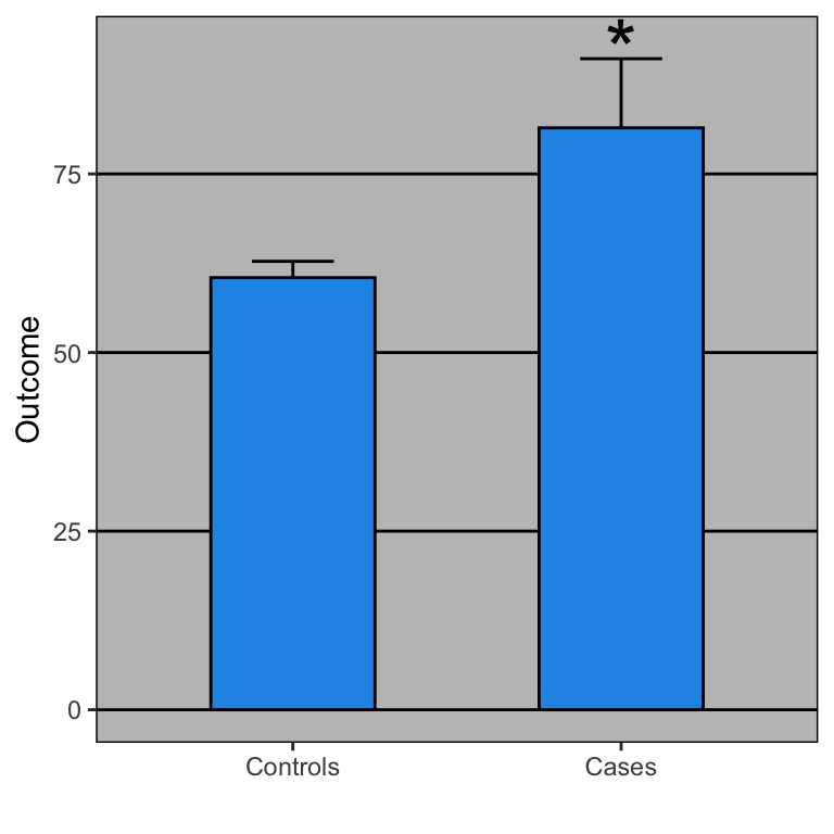
Stars are often added to point out that the differences are statistically significant.
So what is the problem with these plots? First, if you have a print edition of your journal you are wasting ink. No need to waste all that toner just to show these four summaries:
         x average  se
1 Controls      60 2.3
2    Cases      81 9.7
From these numbers you compute the p-value, which in this case is just below 0.05.
Second, the dynamite plot makes it appear as if there is a clear difference between the two groups. Showing the data reveals more information. In our example, showing the data reveals that the lowest blood pressure is actually in the treatment group. It also reveals the presence of one somewhat extreme value of 150. This might represent a data entry mistake. Perhaps systolic pressure was recorded by accident? Note that without that data point, the difference is no longer significant at the 0.05 level.
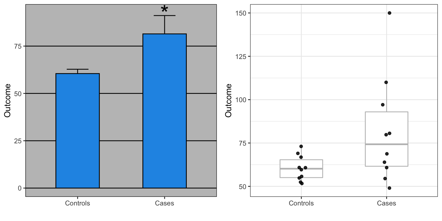
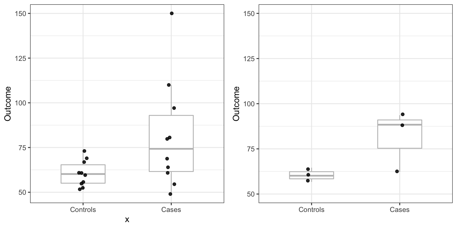
Note also that, as pointed out by Weissgerber, data that look quite different can result in exactly the same barplot. For instance, the two datasets below would produce the same barplot as the one shown above.
What should we do instead?
First, let’s generate the data that we will use in the example R code shown below.
library(tidyverse)
set.seed(0)
n <- 10
cases <- rnorm(n, log2(64), 0.25)
controls <- rnorm(n, log2(64), 0.25)
cases <- 2^(cases)
controls <- 2^(controls)
cases[1:2] <- c(110, 150) #introduce outliers
dat <- data.frame(x = factor(rep(c("Controls", "Cases"), each = n),
                             levels = c("Controls", "Cases")),
                             Outcome = c(controls, cases))
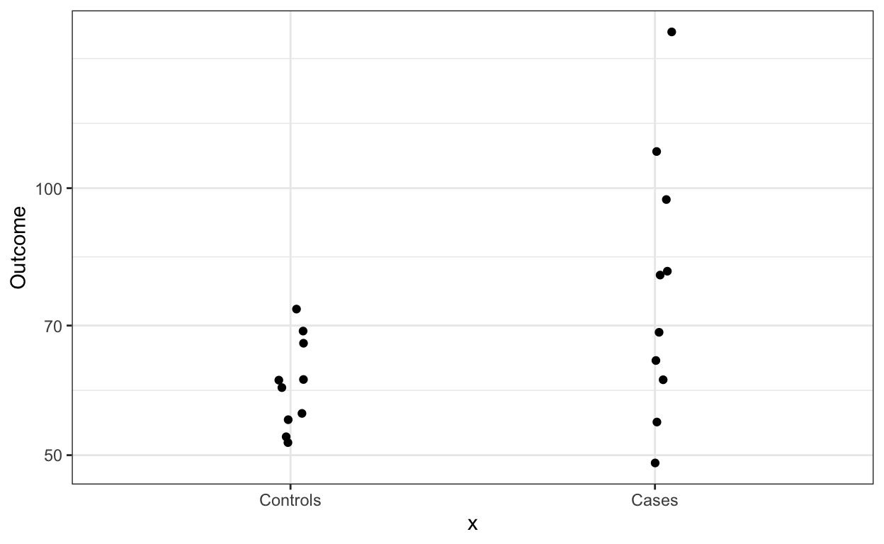
One option is simply to show the data points, which you can do like this:
dat %>% ggplot(aes(x, Outcome)) +
        geom_jitter(width = 0.05)
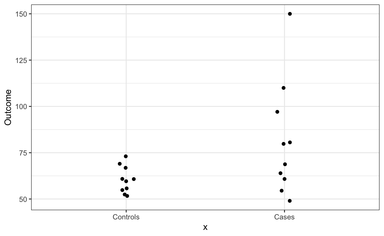
In this case we see that the data is right skewed so we might want to remake the plot in the log scale
dat %>% ggplot(aes(x, Outcome)) +
        geom_jitter(width = 0.05) +
        scale_y_log10()
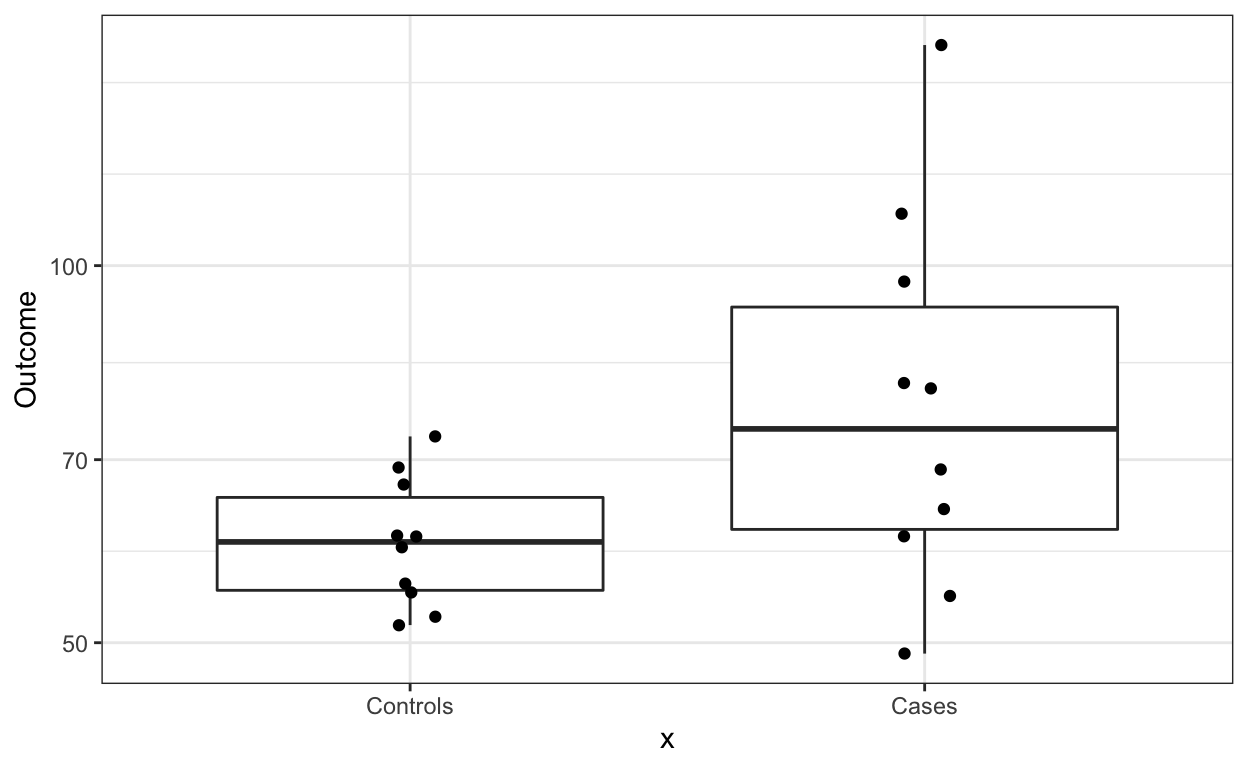
If we want to show summary statistics for the data, we can superimpose a boxplot:
dat %>% ggplot(aes(x, Outcome)) +
        geom_boxplot() +
        geom_jitter(width = 0.05) +
        scale_y_log10()
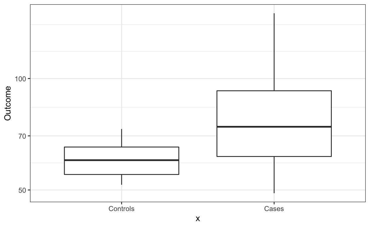
Although not the case here, if there are too many points, we can simply show the boxplot.
dat %>% ggplot(aes(x, Outcome)) +
        geom_boxplot() +
        scale_y_log10()
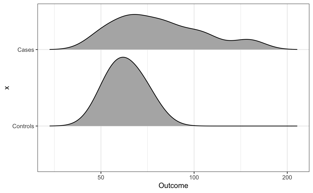
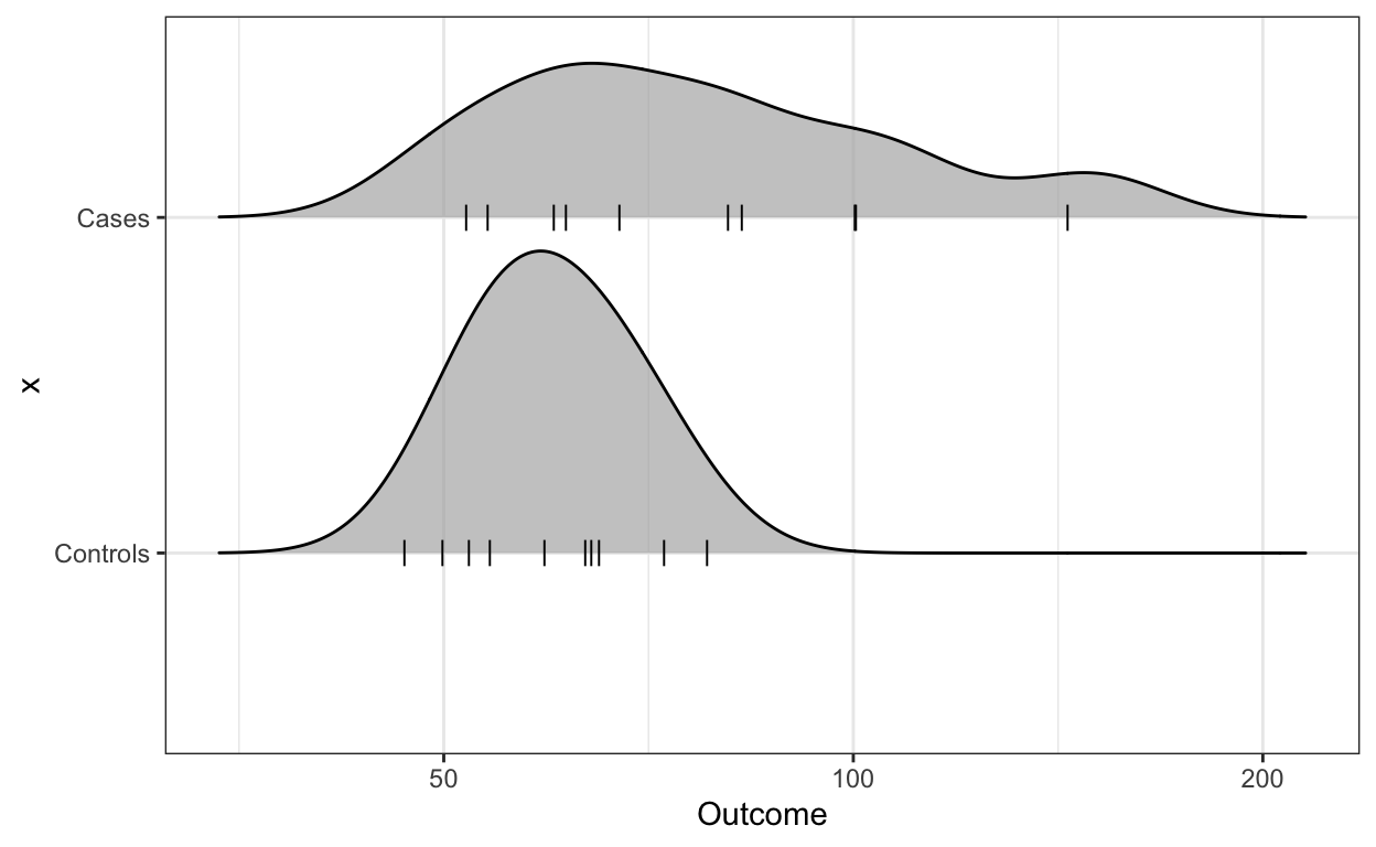
And if we are worried that five summary statistics might be hiding important characteristics of the data, we can use ridge plots.
library(ggridges)
dat %>% ggplot(aes(Outcome, x)) +
        scale_x_log10() +
        geom_density_ridges(scale = 0.9)
If of manageable size, you should show the data points as well:
library(ggridges)
dat %>% ggplot(aes(Outcome, x)) +
        scale_x_log10() +
        geom_density_ridges(scale = 0.9,
                            jittered_points = TRUE,
                            position = position_points_jitter(width = 0.05,
                                                              height = 0),
                            point_shape = '|', point_size = 3,
                            point_alpha = 1, alpha = 0.7)
For more recommendation and Excel templates please consult Weissgerber et al. or this thread.